ALLPCB


Are you struggling to achieve clear, readable markings with silkscreen on red solder mask PCBs? The key lies in choosing the right silkscreen color and design techniques to ensure high contrast and visibility. In this comprehensive guide, we’ll dive deep into the best practices for silkscreen contrast, explore PCB silkscreen colors, and share actionable tips for effective PCB marking techniques. Whether you're a beginner or an experienced engineer, this silkscreen design guide will help you create professional and functional PCB designs.
Introduction to Silkscreen and Solder Mask in PCB Design
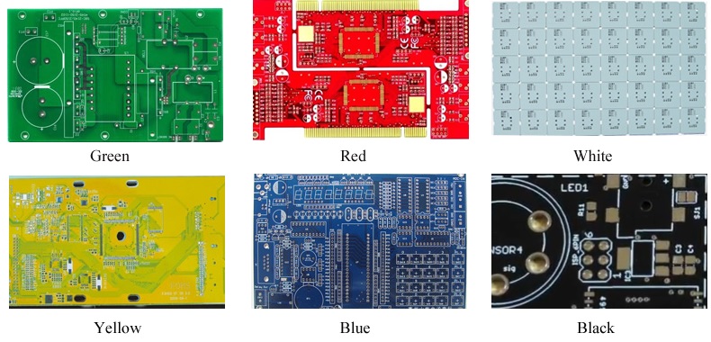
In PCB manufacturing, two critical layers play a significant role in both functionality and aesthetics: the solder mask and the silkscreen. The solder mask is a protective coating, often colored (like red, green, or blue), applied over the copper traces to prevent oxidation, short circuits, and solder bridging during assembly. On the other hand, the silkscreen layer is the printed text or symbols on top of the solder mask, used for labeling components, test points, and other vital information.
When working with a red solder mask, achieving good silkscreen contrast can be a challenge. Red is a bold and visually striking color, often chosen for branding or aesthetic purposes, but it can make certain silkscreen colors hard to read. Poor contrast can lead to assembly errors, debugging difficulties, and an unprofessional appearance. This blog post will walk you through everything you need to know about silkscreen on red solder mask, from color choices to design tips, ensuring your markings are clear and effective.
Why Silkscreen Contrast Matters on Red Solder Mask PCBs
Silkscreen contrast is crucial for readability and functionality. During PCB assembly, technicians rely on silkscreen markings to identify component placements, polarities, and pin numbers. In testing and debugging, clear labels help engineers quickly locate test points or troubleshoot issues. On a red solder mask, which is a darker and more saturated background, the wrong silkscreen color can blend in or become nearly invisible under certain lighting conditions.
High contrast ensures that markings stand out, reducing errors and speeding up the assembly process. For instance, a study in electronics manufacturing found that poor silkscreen visibility can increase assembly errors by up to 15%. With red solder mask PCBs, choosing the right silkscreen color isn't just about looks—it's about efficiency and reliability.
Best Silkscreen Colors for Red Solder Mask PCBs
Selecting the right silkscreen color is the first step to achieving optimal contrast on a red solder mask. Here are the most effective options, along with their pros and cons:
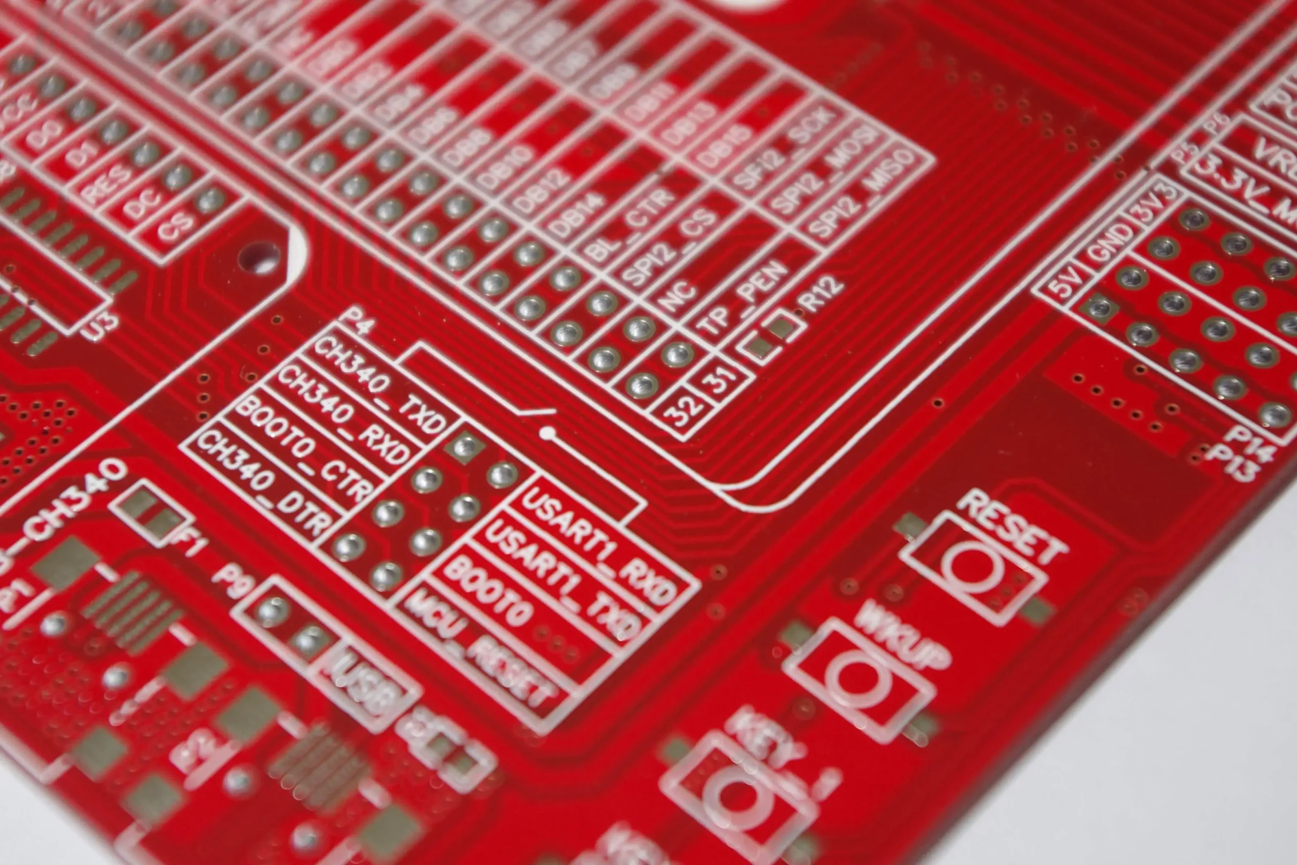
- White Silkscreen: White offers the highest contrast against a red background. It stands out clearly under most lighting conditions, making it the most popular choice for red solder mask PCBs. However, white silkscreen can sometimes show dirt or smudges more easily during handling.
- Yellow Silkscreen: Yellow provides good contrast with red and is less prone to showing dirt compared to white. It works well in well-lit environments but may be harder to read under dim lighting.
- Black Silkscreen: While black can offer decent contrast on lighter shades of red, it often blends into darker red solder masks, making it less ideal. Use black only if the red is very light and testing confirms readability.
Among these, white is generally considered the best silkscreen contrast option for red solder masks due to its visibility and versatility. Many PCB design standards recommend a contrast ratio of at least 3:1 between the silkscreen and solder mask for optimal readability, and white on red easily meets this threshold.
Understanding Color Theory for Silkscreen on Red Solder Mask
Color theory plays a big role in silkscreen contrast. Red, being a warm and dominant color, pairs best with complementary or opposing colors on the color wheel to create visual distinction. White and yellow work well because they are light and neutral tones that pop against red. Black, on the other hand, can get lost because it absorbs light similarly to dark red tones.
Additionally, consider the lighting conditions under which the PCB will be viewed. In manufacturing environments with bright fluorescent lights, lighter silkscreen colors like white and yellow reflect more light and remain visible. In dimmer settings, such as field repairs, you might need to test different shades to ensure readability. Always aim for a high luminance contrast ratio—ideally above 4.5:1 for small text as per accessibility guidelines adapted for industrial use.
PCB Marking Techniques for Better Silkscreen Visibility
Beyond color selection, how you apply and design your silkscreen markings can significantly impact visibility on red solder mask PCBs. Here are some proven PCB marking techniques:
- Use Bold Fonts and Larger Text Sizes: Opt for sans-serif fonts like Arial or Helvetica with a minimum height of 0.8 mm (31 mils) for small text and 1.5 mm (59 mils) for critical labels. Thin or intricate fonts can become unreadable after printing due to ink bleeding or resolution limits.
- Increase Line Thickness: Ensure silkscreen lines have a minimum thickness of 0.15 mm (6 mils) to prevent them from fading or breaking during the printing process.
- Avoid Overcrowding: Leave at least 0.2 mm (8 mils) of spacing between text and nearby elements like pads or vias to avoid overlap and ensure clarity.
- Apply a Double Silkscreen Layer: For critical markings, some manufacturers offer a double-pass silkscreen process to make the ink more opaque and vibrant, enhancing contrast on darker backgrounds like red.
- Position Strategically: Place silkscreen markings away from areas prone to wear or where components might obscure them. For example, avoid placing text under large connectors or heatsinks.
These techniques, when combined with the right silkscreen color, can drastically improve the usability of your PCB design. Always check with your PCB fabrication house for their specific silkscreen resolution capabilities, as some may have tighter constraints on minimum text size or line width.
Silkscreen Design Guide: Step-by-Step Process
Creating effective silkscreen on red solder mask PCBs requires a systematic approach. Follow this silkscreen design guide to ensure success:
- Define Your Requirements: List all the markings your PCB needs, such as component identifiers (e.g., R1, C2), polarity indicators, and test points. Prioritize critical labels that must remain visible post-assembly.
- Choose the Right Software Tools: Use PCB design software with robust silkscreen editing features. Ensure the tool allows you to preview contrast against your chosen solder mask color (red, in this case).
- Select Silkscreen Color: Based on the recommendations above, pick a high-contrast color like white or yellow. Confirm with your manufacturer if they support your chosen color without additional cost.
- Apply Design Rules: Set minimum text sizes, line thicknesses, and spacing as per the guidelines mentioned earlier. Use design rule checks (DRC) in your software to catch potential issues early.
- Preview and Test: Generate a render or prototype of your PCB design to evaluate silkscreen visibility under different lighting conditions. If possible, order a small batch to test real-world readability before full production.
- Iterate Based on Feedback: If markings are unclear, adjust the color, size, or placement and re-test. Collaboration with your assembly team can provide valuable insights into practical challenges.
Following these steps ensures that your silkscreen markings are not only visually appealing but also functional for assembly and maintenance purposes.
Common Challenges with Silkscreen on Red Solder Mask and How to Overcome Them
Designing silkscreen for red solder mask PCBs comes with unique challenges. Here are some common issues and solutions:
- Low Contrast: If the silkscreen color blends into the red background, switch to a lighter color like white. Test samples under various lighting to confirm visibility.
- Ink Bleeding: Red solder masks can sometimes cause silkscreen ink to spread slightly due to surface tension differences. Work with your manufacturer to ensure they use high-quality ink and curing processes. Specify a minimum line width of 0.15 mm (6 mils) to mitigate this.
- Color Variation: Different batches of red solder mask may vary slightly in shade, affecting contrast. Request a consistent solder mask formulation from your supplier, and always review proofs before full production runs.
- Wear and Tear: Silkscreen markings can fade over time due to handling or environmental exposure. Consider using a protective coating over the silkscreen if the PCB will be used in harsh conditions.
By anticipating these challenges and planning accordingly, you can avoid costly redesigns and ensure a high-quality end product.
Advanced Tips for Professional Silkscreen Design on Red Solder Mask PCBs
For engineers looking to take their PCB designs to the next level, consider these advanced tips for silkscreen on red solder mask:
- Use Negative Silkscreen for Emphasis: In areas where text needs to stand out even more, consider using a negative silkscreen technique—where the text is the solder mask color (red) surrounded by a silkscreen box (white or yellow). This can create a striking visual effect.
- Experiment with Custom Colors: While white and yellow are standard, some manufacturers offer custom silkscreen colors. A light gray or silver might provide a unique look while maintaining contrast on red.
- Integrate Branding: Use the silkscreen layer to add logos or brand identifiers in a contrasting color. This not only enhances aesthetics but also helps with product recognition.
- Account for Automated Assembly: If your PCBs will be assembled using pick-and-place machines, ensure silkscreen markings include fiducial marks or reference points for machine vision systems. Keep these marks in high-contrast colors.
These advanced techniques can differentiate your PCB design, making it both functional and visually impressive.
Conclusion: Mastering Silkscreen Contrast on Red Solder Mask PCBs
Achieving the best silkscreen contrast on red solder mask PCBs is a blend of science and art. By selecting the right silkscreen colors—such as white or yellow—and applying proven PCB marking techniques, you can ensure your markings are clear, readable, and professional. Follow the silkscreen design guide outlined in this post to avoid common pitfalls and create designs that streamline assembly and debugging.
Remember, the goal is to balance aesthetics with functionality. High contrast not only makes your PCB look better but also reduces errors and improves efficiency. Whether you're labeling components or adding branding elements, thoughtful silkscreen design on red solder mask PCBs can make a significant difference in your project's success.