ALLPCB


In the world of printed circuit board (PCB) manufacturing, precision is everything. One often overlooked factor that can significantly affect the quality control process is the silkscreen font size used on PCBs. So, how does silkscreen font size impact Automated Optical Inspection (AOI)? Simply put, the font size directly influences the readability of component labels and markings during AOI, which is a critical step for detecting defects and ensuring high-quality boards. If the font is too small or poorly designed, AOI systems may struggle to interpret the markings, leading to errors or missed defects.
In this comprehensive guide, we’ll dive deep into the relationship between silkscreen font size and AOI, exploring key considerations for optimizing readability, meeting AOI silkscreen requirements, and improving overall inspection accuracy. Whether you’re a PCB designer or a manufacturer, this post will provide actionable insights to enhance your production process.
What Is Automated Optical Inspection (AOI) in PCB Manufacturing?
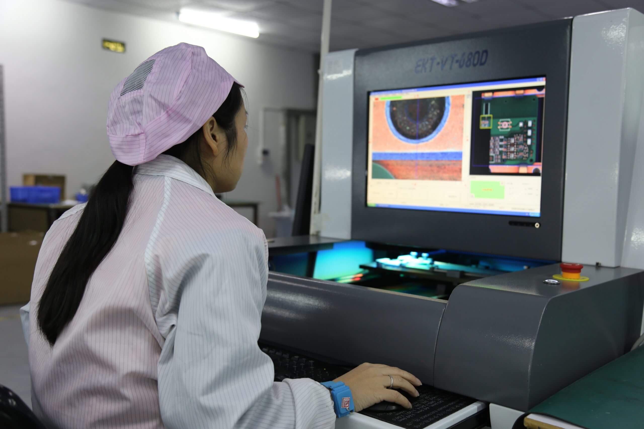
Automated Optical Inspection, commonly known as AOI, is a vital quality control process in PCB manufacturing. Using high-resolution cameras, advanced lighting, and image processing software, AOI systems scan the surface of a PCB to detect defects such as missing components, misalignments, solder issues, or scratches. This technology is especially crucial for modern, densely packed boards where manual inspection is impractical due to the sheer number of tiny components—often thousands of solder joints on a single board.
AOI ensures that defects are caught early in the production process, reducing the risk of costly rework or product failures. However, for AOI to work effectively, every element on the PCB, including the silkscreen layer, must be designed with inspection in mind. This brings us to the importance of silkscreen readability in AOI.
Understanding the Role of Silkscreen in PCB Design
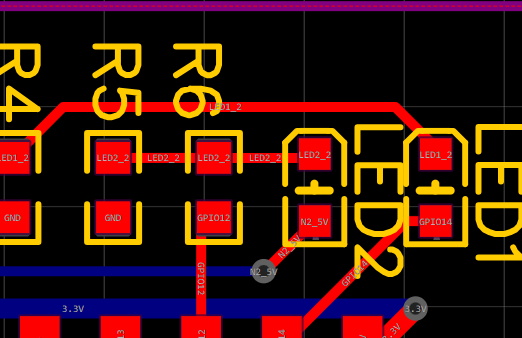
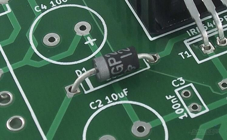
The silkscreen layer on a PCB is more than just a decorative element. It serves as a visual guide, providing essential information such as component labels (e.g., "R1" for a resistor), polarity markers, test points, and assembly instructions. These markings are critical during assembly, testing, and troubleshooting, ensuring that engineers and technicians can quickly identify parts and orientations.
While the primary purpose of silkscreen is human readability, it also plays a significant role in automated processes like AOI. Many AOI systems rely on silkscreen markings to verify component placement and orientation. If the font size or style is not optimized, the system may misread or fail to recognize these markings, leading to inspection errors.
How Silkscreen Font Size Affects AOI Readability
The font size used in the silkscreen layer is a critical factor for AOI readability. Here’s how it impacts the inspection process:
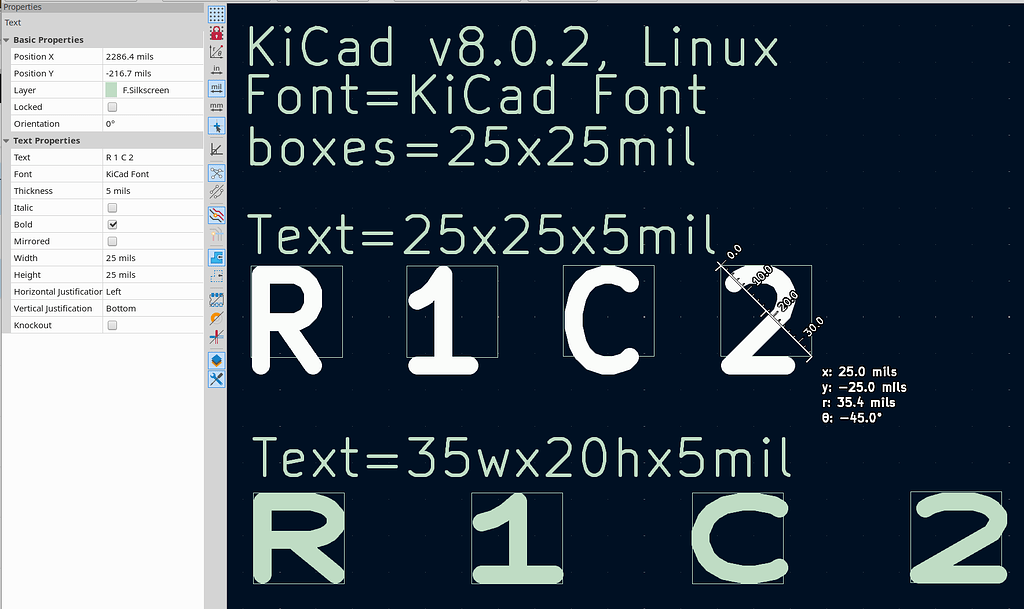
- Clarity for Cameras: AOI systems use high-resolution cameras to capture images of the PCB surface. If the silkscreen font size is too small—say, below 5 mils (0.005 inches) in height—the cameras may struggle to distinguish individual characters, especially under varying lighting conditions or if there’s slight distortion in the image.
- Contrast and Resolution: Smaller fonts often suffer from reduced contrast, especially if the silkscreen ink is not uniformly applied. AOI systems require a clear contrast between the silkscreen markings and the PCB background (often green or another color) to process the data accurately. A font size of at least 6-8 mils is generally recommended for reliable detection.
- Component Density: Modern PCBs are often densely populated, leaving little space for silkscreen text. Designers may be tempted to use smaller fonts to fit labels into tight areas. However, this compromises AOI readability, as the system may misinterpret or entirely miss critical markings.
Key AOI Silkscreen Requirements for Optimal Inspection
To ensure that silkscreen markings are compatible with AOI systems, designers must adhere to specific guidelines. While exact requirements may vary depending on the AOI equipment and manufacturer standards, the following are widely accepted best practices for silkscreen font AOI compatibility:
1. Minimum Font Size
A common industry guideline suggests a minimum silkscreen font size of 6 mils (0.006 inches) in height for AOI readability. However, for optimal results, a height of 8-10 mils is preferred, especially for complex boards where camera resolution or lighting might be less than ideal. This ensures that characters are large enough to be captured clearly by AOI cameras, even at high magnification.
2. Font Style and Line Width
Beyond size, the style of the font matters. Simple, sans-serif fonts with uniform line widths (typically 1-2 mils) are ideal for AOI. Avoid overly intricate or decorative fonts, as they can blur or distort under camera inspection. The spacing between characters should also be sufficient—at least 1 mil—to prevent characters from blending together.
3. Contrast with Background
Silkscreen markings must contrast sharply with the PCB’s solder mask color. White silkscreen on a green or black background is a common choice for maximum visibility. AOI systems rely on this contrast to differentiate text from the surrounding material, so ensure that the ink quality and application are consistent across the board.
4. Placement of Markings
Place silkscreen labels close to the corresponding components but avoid overlapping with solder pads or vias. Overlapping can cause visual noise during AOI, making it harder for the system to interpret the markings. Additionally, ensure that markings are not placed in areas prone to wear or damage during assembly, as this could degrade readability.
Challenges of Balancing Silkscreen Design with PCB Constraints
Designing silkscreen for AOI readability isn’t always straightforward. PCB designers often face trade-offs due to space limitations and manufacturing constraints. Here are some common challenges and how to address them:
- Limited Space: On densely packed boards, there may not be enough room for larger fonts. In such cases, prioritize critical markings (e.g., polarity indicators) and use the minimum recommended font size of 6 mils. If space is extremely tight, consider abbreviating labels or using standardized symbols that AOI systems can recognize.
- Manufacturing Tolerances: Silkscreen printing isn’t always perfect. Ink may spread or smudge, especially with smaller fonts, reducing readability. Work with your manufacturing partner to ensure high-quality silkscreen application and test samples under AOI conditions before full production.
- Cost Considerations: Larger or more detailed silkscreen designs may increase production costs due to the need for finer printing techniques. Balance the need for readability with budget constraints by focusing on essential markings and optimizing font size without overcomplicating the design.
Practical Tips for Optimizing Silkscreen Readability in AOI
Now that we’ve covered the basics of AOI silkscreen requirements, let’s explore some actionable tips to improve silkscreen readability for automated inspection of PCBs:
- Test with AOI Equipment Early: Before finalizing your PCB design, run a prototype through the AOI system to check if the silkscreen markings are readable. Adjust font size or style based on the results. For instance, if the system struggles with 6-mil text, increase it to 8 mils and retest.
- Use Consistent Standards: Adopt a standardized font size and style across all your PCB designs to simplify AOI setup. Consistency reduces the need to recalibrate inspection equipment for each new board design.
- Collaborate with Manufacturers: Your manufacturing partner can provide valuable feedback on silkscreen capabilities and limitations. Discuss your AOI requirements upfront to ensure the silkscreen process aligns with inspection needs.
- Leverage Design Software Tools: Many PCB design tools allow you to simulate AOI conditions or preview silkscreen readability. Use these features to identify potential issues with font size or placement before sending the design for production.
The Consequences of Poor Silkscreen Design on PCB Inspection Font Size
Neglecting silkscreen font size and readability can have serious repercussions during AOI and beyond. Here are some potential issues:
- Missed Defects: If AOI systems cannot read silkscreen markings, they may fail to verify component placement or orientation, allowing defects to slip through. For example, a misaligned polarity marker could lead to a reversed component going undetected.
- Increased False Positives: Poorly readable silkscreen can confuse AOI systems, triggering false defect alerts. This wastes time as operators must manually verify each flagged issue, slowing down production.
- Assembly Errors: Beyond AOI, unreadable silkscreen affects human operators during assembly and repair. If technicians misinterpret markings due to small font sizes, it could result in costly mistakes or product failures.
Industry Standards and Best Practices for Silkscreen in Automated Inspection PCB
While there are no universal standards for silkscreen font size in AOI, several industry guidelines can help. The IPC (Institute of Printed Circuits) recommends a minimum text height of 0.040 inches (40 mils) for human readability, but for AOI-specific purposes, smaller sizes like 6-10 mils are often sufficient due to high camera magnification. However, always consult with your AOI equipment provider for specific recommendations, as camera resolution and software capabilities vary.
Additionally, adhering to general PCB design best practices—such as maintaining clear contrast and avoiding clutter—can significantly improve silkscreen readability during automated inspection. Staying updated on evolving AOI technology is also key, as newer systems may have enhanced capabilities for reading smaller fonts or lower-contrast markings.
Conclusion: Prioritizing Silkscreen Readability for AOI Success
The impact of silkscreen font size on Automated Optical Inspection cannot be overstated. A well-designed silkscreen layer with appropriate font size, style, and placement ensures that AOI systems can accurately detect defects and verify component placement, ultimately leading to higher-quality PCBs. By following AOI silkscreen requirements—such as maintaining a minimum font size of 6-8 mils, using simple fonts, and ensuring high contrast—designers can avoid common pitfalls and streamline the inspection process.
Optimizing silkscreen readability for AOI is not just about meeting technical standards; it’s about enhancing the reliability and efficiency of your entire manufacturing workflow. Whether you’re designing a simple board or a complex, high-density PCB, paying attention to details like PCB inspection font size can make all the difference in achieving flawless production outcomes.
At ALLPCB, we’re committed to supporting engineers and manufacturers with the tools and knowledge needed for success. By incorporating these best practices into your designs, you can ensure that your PCBs pass AOI with flying colors, delivering reliable performance in every application.