ALLPCB


For electrical engineers, understanding PCB silkscreen colors is crucial for efficient design, assembly, and troubleshooting. The silkscreen layer on a printed circuit board (PCB) provides vital text and symbols to identify components, test points, and other circuit information. But what do the colors mean, and which ones work best? In this comprehensive guide, we dive into PCB silkscreen color meaning, PCB silkscreen color standards, and tips for choosing the best silkscreen color for readability. Whether you're working with a white silkscreen PCB or a yellow silkscreen PCB, this post will help you make informed decisions for optimal PCB silkscreen color contrast.
What Is PCB Silkscreen and Why Does Color Matter?
The silkscreen layer, often called the legend layer, is a non-conductive ink applied to the surface of a PCB. It displays important information like component labels (e.g., R1 for a resistor), polarity markers, test points, and sometimes logos or warnings. This layer is essential for guiding assembly, ensuring correct component placement, and aiding in repairs or debugging.
Color plays a significant role in the silkscreen layer. It affects readability, visibility under different lighting conditions, and even the cost of manufacturing. Choosing the right color can reduce assembly errors, improve troubleshooting efficiency, and ensure the board meets industry standards. Let’s explore the key aspects of PCB silkscreen color meaning and why it’s a critical consideration for engineers.
Common PCB Silkscreen Colors and Their Meanings
While silkscreen colors don’t have universal meanings tied to specific functions, certain colors are more common due to practical reasons like visibility and manufacturing standards. Here’s a breakdown of the most widely used colors in PCB silkscreen design:
White Silkscreen PCB
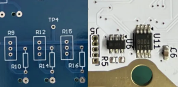
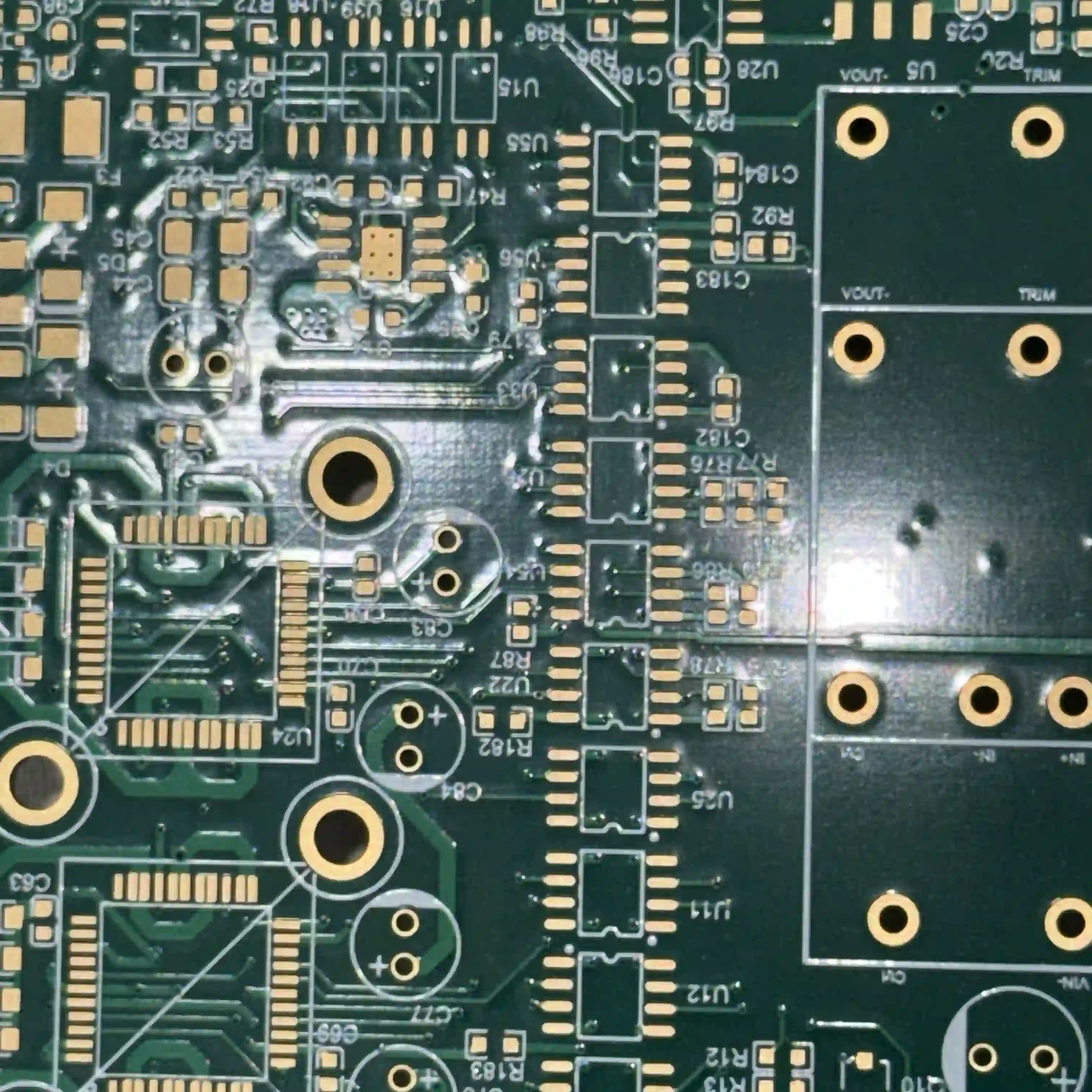
White is one of the most popular silkscreen colors, especially on darker PCB substrates like green or black. A white silkscreen PCB offers excellent contrast against these backgrounds, making text and symbols easy to read. It’s often used in consumer electronics and industrial applications where clarity is a priority. White ink is also widely available and cost-effective, aligning with many PCB silkscreen color standards.
Yellow Silkscreen PCB
Yellow is another common choice for silkscreen, particularly when high visibility is needed. A yellow silkscreen PCB stands out under various lighting conditions, including low-light environments. This color is often used in automotive or outdoor applications where boards may be inspected in challenging conditions. Yellow provides good PCB silkscreen color contrast on darker boards and is a practical option for engineers prioritizing the best silkscreen color for readability.
Black Silkscreen
Black silkscreen is less common but useful on lighter-colored PCBs, such as white or beige substrates. It provides a sharp contrast for easy reading. However, black ink can be harder to see under certain lighting, so it’s typically used in controlled environments like lab settings or prototypes where visibility isn’t a major concern.
PCB Silkscreen Color Standards: What Engineers Should Know
While there are no strict global standards dictating specific PCB silkscreen color standards, certain guidelines and industry practices help ensure consistency and functionality. Organizations like the Institute of Printed Circuits (IPC) provide recommendations for PCB design, including silkscreen application. According to IPC-A-610, a widely accepted standard for PCB assembly, silkscreen markings should be legible and durable under normal operating conditions.
Here are key considerations from industry practices regarding PCB silkscreen color standards:
- Contrast and Legibility: The silkscreen color must contrast with the PCB substrate to ensure readability. For example, white or yellow ink is preferred on green or black boards, while black ink works better on lighter substrates.
- Durability: The ink must withstand soldering processes, cleaning agents, and environmental factors like heat or humidity. Most manufacturers use epoxy-based, non-conductive inks that meet these requirements.
- Cost and Availability: Standard colors like white, yellow, and black are often more affordable and readily available compared to custom colors, which can increase production costs.
For engineers, adhering to these practical standards ensures that the silkscreen layer serves its purpose without adding unnecessary complexity or expense to the manufacturing process.
Choosing the Best Silkscreen Color for Readability
Selecting the best silkscreen color for readability depends on several factors, including the PCB substrate color, the intended application, and the working environment. Here’s a detailed look at how to make the right choice:
1. Consider PCB Substrate Color for Contrast
The most important factor in achieving PCB silkscreen color contrast is the relationship between the silkscreen ink and the PCB background. A green PCB, which is the most common substrate color due to its low cost and familiarity, pairs well with white or yellow silkscreen for maximum visibility. On a black PCB, often used in high-end or aesthetic applications, white silkscreen tends to stand out better than yellow under most lighting conditions.
For example, if you’re designing a board with a blue substrate, often used for specific industrial or military applications, a white silkscreen might provide the best contrast. Testing different color combinations during the prototype phase can help confirm the optimal pairing.
2. Evaluate Lighting Conditions
The environment where the PCB will be assembled or inspected influences color choice. In low-light settings, a yellow silkscreen PCB can be easier to read because yellow reflects light better than white or black. For well-lit environments, such as cleanroom assembly lines, a white silkscreen PCB often provides sufficient clarity and is a standard choice.
3. Account for Application-Specific Needs
Different applications may have unique requirements. For instance, in automotive electronics, where boards are often exposed to vibration and temperature extremes, a durable yellow silkscreen might be preferred for its visibility during field repairs. In contrast, consumer electronics often use white silkscreen for its clean, professional appearance and cost-effectiveness.
Factors Affecting PCB Silkscreen Color Contrast
Achieving optimal PCB silkscreen color contrast goes beyond just picking a color. Several technical and environmental factors influence how well the silkscreen stands out on the board. Here are the key elements to consider:
- Ink Thickness and Quality: The thickness of the silkscreen ink layer, typically around 0.0005 to 0.001 inches (12.7 to 25.4 microns), affects its opacity and visibility. High-quality inks ensure consistent coverage without fading over time.
- Font Size and Style: Silkscreen text should be at least 0.06 inches (1.5 mm) tall to remain legible, as per common industry guidelines. Simple, sans-serif fonts enhance readability, especially in smaller sizes.
- Surface Finish: The PCB’s surface finish, such as HASL (Hot Air Solder Leveling) or ENIG (Electroless Nickel Immersion Gold), can reflect light differently, impacting how silkscreen colors appear. A matte finish may reduce glare, improving contrast for white or yellow ink.
- Environmental Exposure: Over time, exposure to UV light, heat, or chemicals can cause silkscreen colors to fade. Choosing UV-resistant inks or protective coatings can maintain PCB silkscreen color contrast in harsh conditions.
Practical Tips for Designing PCB Silkscreen Layers
Beyond color selection, designing an effective silkscreen layer involves attention to detail and collaboration with manufacturing teams. Here are actionable tips for electrical engineers:
- Keep Markings Clear and Concise: Only include essential information like component designators (e.g., C1 for capacitors), polarity indicators, and test points. Avoid cluttering the board with unnecessary text or logos that could obscure critical details.
- Specify Color Preferences Early: Communicate your silkscreen color choice during the design phase to avoid delays or additional costs. Most PCB design software allows you to set silkscreen colors in the layout editor for accurate previews.
- Test Readability in Prototypes: Before mass production, review physical prototypes to ensure the chosen silkscreen color provides adequate contrast and visibility under real-world conditions.
- Consider Dual-Sided Silkscreen Carefully: Applying silkscreen on both the component and solder sides can increase costs. Reserve dual-sided markings for complex boards where bottom-side information is critical for assembly or repair.
 "
"
Challenges and Limitations of PCB Silkscreen Colors
While silkscreen colors enhance PCB functionality, there are challenges to consider. Custom colors beyond standard white, yellow, or black can significantly increase manufacturing costs due to specialized inks and processes. Additionally, very small boards or densely populated designs may limit silkscreen space, making it hard to achieve legible markings regardless of color.
Another limitation is color fading over time, especially in harsh environments. For instance, a board exposed to high temperatures (above 85°C) or direct sunlight for prolonged periods may lose silkscreen clarity, impacting long-term readability. Protective coatings or conformal layers can mitigate this issue, but they add to the overall cost.
How Silkscreen Colors Impact Manufacturing and Cost
The choice of silkscreen color can influence both the manufacturing process and the final cost of the PCB. Standard colors like white and yellow are typically included in baseline pricing by most manufacturers due to their widespread use and availability. However, opting for non-standard colors or dual-sided silkscreen can raise costs by 10-20%, depending on the complexity and volume of the order.
Moreover, the silkscreen process itself, whether done via manual screen printing, liquid photo imaging (LPI), or direct legend printing (DLP), affects turnaround time. LPI, for example, offers higher precision for fine text but may take longer than traditional methods, especially for custom colors.
Conclusion: Making the Right Choice for Your PCB Silkscreen Color
Understanding PCB silkscreen color meaning and adhering to practical PCB silkscreen color standards are essential skills for electrical engineers. Whether you choose a white silkscreen PCB for its clean look and cost-effectiveness or a yellow silkscreen PCB for superior visibility, the goal is to ensure the best silkscreen color for readability and optimal PCB silkscreen color contrast. By considering factors like substrate color, lighting conditions, and application needs, you can design boards that are easier to assemble, inspect, and maintain.
At ALLPCB, we’re committed to helping engineers navigate these decisions with high-quality manufacturing solutions tailored to your specifications. With careful planning and attention to silkscreen design, your PCBs can achieve both functionality and clarity, ensuring success in every project.