ALLPCB


Why Silk Screen Color Matters in Electronic Products
Silk screen color on printed circuit boards serves both functional and perceptual roles in electronic products. Engineers select colors to ensure markings remain legible while influencing how users interpret the device. Choices in silkscreen hue affect readability during assembly and maintenance, as well as broader impressions of reliability and professionalism. In PCB design workflows, color decisions integrate with layout rules to balance technical performance and human factors.
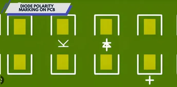
Silk screen, also known as legend or marking ink, prints component identifiers, polarity indicators, and warnings directly onto the board surface. The color of this layer determines contrast against the solder mask, which directly impacts assembly accuracy and field service efficiency. Poor contrast increases error rates in manual inspection or rework processes. Beyond functionality, color selection shapes initial user reactions to the finished product, contributing to perceptions of quality and brand consistency across product lines.
Industry standards guide these selections to maintain consistency. IPC-A-600 specifies acceptability criteria for printed board markings, emphasizing legibility under typical operating conditions. Designers reference such guidelines early in the layout phase to avoid costly revisions later.
Technical Principles of Color Selection
Silk screen inks must adhere reliably to the solder mask while withstanding thermal cycling, cleaning processes, and environmental exposure. White remains the predominant choice because it provides strong contrast on common green solder masks, supporting clear visibility of fine text and symbols. Alternative colors such as black, yellow, or red become relevant when the solder mask deviates from green or when specific identification needs arise, such as distinguishing high-voltage sections.
Contrast ratios follow practical engineering rules rather than subjective preference. A color must remain distinguishable after reflow soldering and conformal coating application. IPC-2221 outlines general design requirements that include spacing and placement rules for markings to preserve both electrical performance and visual clarity. Engineers evaluate ink adhesion properties alongside color to ensure long-term durability without compromising board integrity.
Impact of Silk Screen Color on User Perception and Brand Recognition
Color influences how technicians and end users perceive an electronic assembly. High-contrast combinations, such as white on green, convey precision and standard compliance, reinforcing confidence in the product's engineering. In contrast, specialized colors can signal particular functions, for example, red markings for safety-critical areas, helping users quickly locate important information during troubleshooting.
These perceptual effects support brand recognition when consistent color schemes appear across multiple products. Procurement teams and design reviewers often associate specific palettes with established quality levels, even though the underlying circuitry remains unchanged. Emotional responses remain secondary to functional requirements, yet they accumulate through repeated exposure in professional environments.
Best Practices for PCB Designers
Designers begin by confirming solder mask color and required contrast before finalizing silkscreen specifications. Text height and line width follow minimum thresholds that ensure readability after manufacturing tolerances are applied. Placement avoids overlap with pads or vias while maintaining adequate clearance from conductive features.
Testing under simulated lighting conditions verifies performance in real-world assembly and service settings. When multiple colors are considered, engineers document the rationale in design reviews to align with project requirements for identification and safety. Consistent application across revisions supports traceability and reduces misinterpretation during production handoff.
Conclusion
Silk screen color decisions in electronic products combine engineering constraints with perceptual considerations. Logical selection prioritizes contrast, durability, and compliance while supporting efficient assembly and service. Structured evaluation during the design phase ensures markings fulfill both technical and human-factor objectives across diverse applications.
FAQs
Q1: How does silkscreen color psychology influence product perception in electronics?
A1: Silkscreen color affects how users and technicians interpret an electronic assembly through contrast and visual cues. High-visibility combinations support quick identification of components and warnings, contributing to impressions of reliability. Engineers balance these perceptual aspects with manufacturing requirements to maintain consistent product presentation.
Q2: What role does silkscreen color play in brand recognition for electronic devices?
A2: Consistent silkscreen color schemes help distinguish product families and reinforce professional standards. When colors align across designs, they aid recognition during inspection or maintenance without altering electrical function. Designers incorporate these choices within established layout guidelines to achieve repeatable outcomes.
Q3: How can silkscreen color impact user emotions or usability in PCB applications?
A3: Color choices influence readability and the speed of locating critical information, which indirectly shapes user confidence during operation or repair. Standard high-contrast options reduce cognitive load in technical environments. Practical testing confirms that selected colors meet both visibility and durability criteria under expected conditions.
Q4: What considerations guide silkscreen color selection for optimal brand and functional results?
A4: Selection begins with solder mask compatibility and required contrast levels to ensure legibility after processing. Engineers evaluate adhesion, environmental resistance, and placement rules before committing to a color. Documentation of these decisions supports alignment with overall project goals for identification and quality.
References
IPC-A-600K — Acceptability of Printed Boards. IPC, 2020
IPC-2221B — Generic Standard on Printed Board Design. IPC, 2012
IPC-6012E — Qualification and Performance Specification for Rigid Printed Boards. IPC, 2017