ALLPCB


Introduction
Serious cardiovascular conditions such as heart disease and coronary artery disease cause many fatalities each year. People who survive such conditions must often change lifestyle and medical routines to reduce the risk of future events.
I found a heart disease dataset on Kaggle and used it here for exploratory analysis (dataset download and source code are noted at the end).
Data loading and brief description
First, import libraries and set up parameters for subsequent analysis.
import numpy as np import pandas as pd import matplotlib.pyplot as plt import seaborn as sns
Reading and describing the dataset shows 303 rows and 14 columns. The column names are age, sex, cp, ..., target. Below are the field meanings based on the dataset documentation:
- age: subject age
- sex: subject sex (1 = male, 0 = female)
- cp: chest pain type (values: 1 = typical angina, 2 = atypical angina, 3 = non-anginal pain, 4 = asymptomatic)
- trestbps: resting blood pressure (in mm Hg on admission)
- chol: serum cholesterol in mg/dl
- fbs: fasting blood sugar > 120 mg/dl (1 = true; 0 = false)
- restecg: resting electrocardiographic results (0 = normal, 1 = ST-T wave abnormality, 2 = probable or definite left ventricular hypertrophy)
- thalach: maximum heart rate achieved
- exang: exercise induced angina (1 = yes; 0 = no)
- oldpeak: ST depression induced by exercise relative to rest
- slope: slope of the peak exercise ST segment (1 = upsloping, 2 = flat, 3 = downsloping)
- ca: number of major vessels (0-4) colored by fluoroscopy
- thal: a blood disorder called thalassemia (3 = normal; 6 = fixed defect; 7 = reversible defect)
- target: presence of heart disease (0 = no, 1 = yes)
These features are physiological measurements for subjects; the dataset does not include lifestyle variables such as smoking, sleep habits, family history, or daily routines, so it cannot directly provide lifestyle guidance.
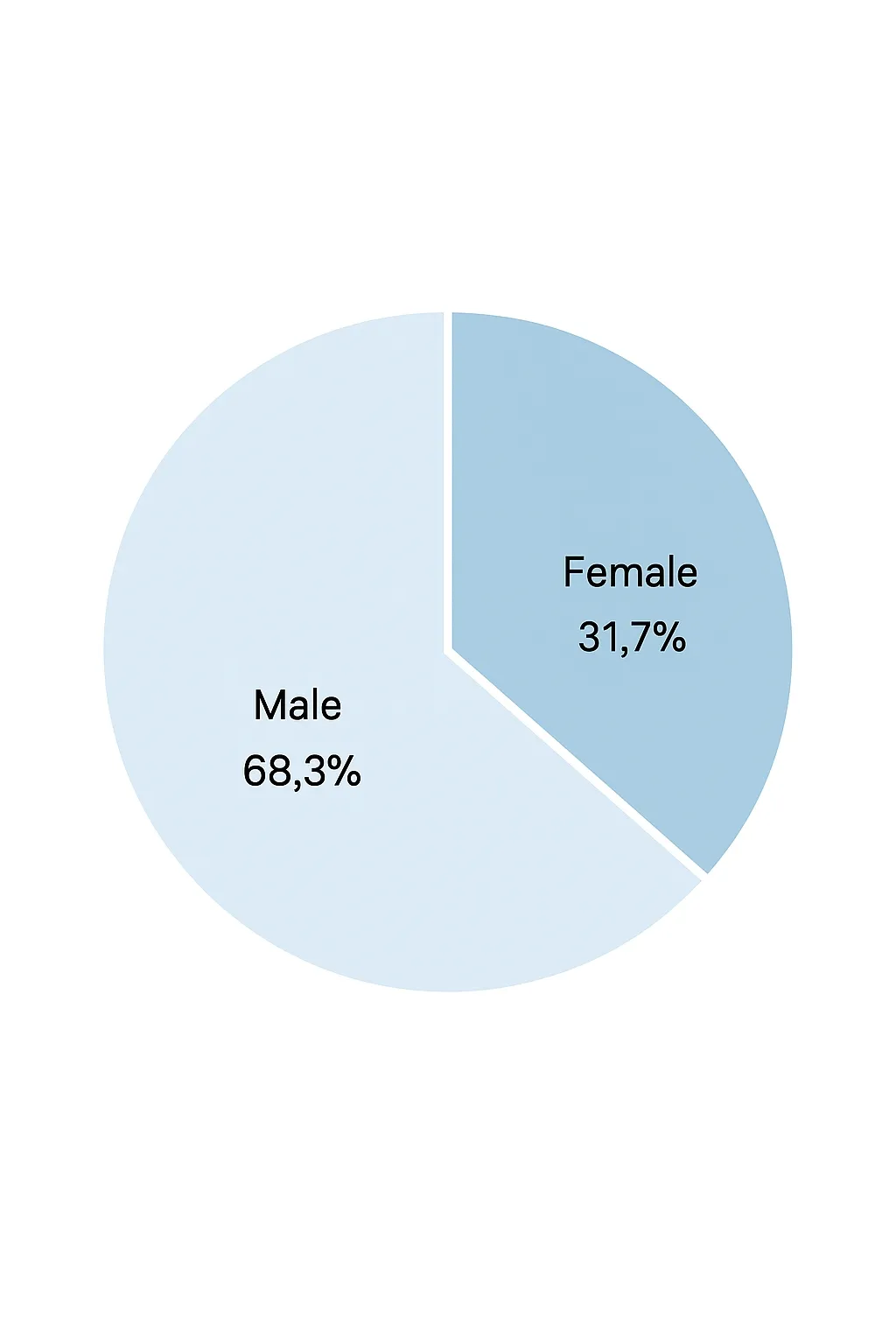
Gender ratio and basic counts
Check the counts and ratios for disease presence and sex distribution.
The code produced the following output:
No-disease count: 138, no heart disease rate: 45.54%
Have-disease count: 165, heart disease rate: 54.46%
Female count: 96, female ratio: 31.68%
Male count: 207, male ratio: 68.32%
Visualizing the distributions provides additional context.
From the plots, male subjects outnumber female subjects in this sample, and the group labeled target=1 (disease) is larger than target=0. The violin plot of age by sex and target shows a higher proportion of female patients in this dataset.
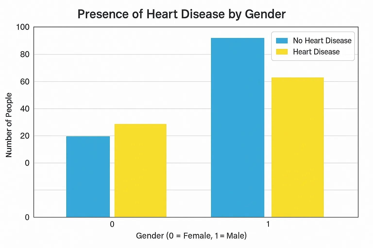
In this sample the number of female patients is more than three times the number of healthy females, which raises the question whether women are more likely to have heart disease. That question requires literature review and larger datasets; this article does not attempt to generalize beyond this sample.
In this dataset, males outnumber females roughly two to one (207 vs 96), and disease cases slightly outnumber non-disease cases (165 vs 138). The sample-specific disease rates are approximately 44.9% for males and 75% for females within this dataset. Note that these rates apply only to this dataset.
Age and disease relationship
Examine whether disease rate changes with age.
The bar chart shows that ages 37–54 have more disease cases than non-disease cases in this sample. There is a rise in disease cases again after age 70. This visualization is descriptive and not a population-level conclusion.
Age, maximum heart rate, and disease
The field thalach stores the maximum heart rate reached. Plot age, maximum heart rate, and disease status together.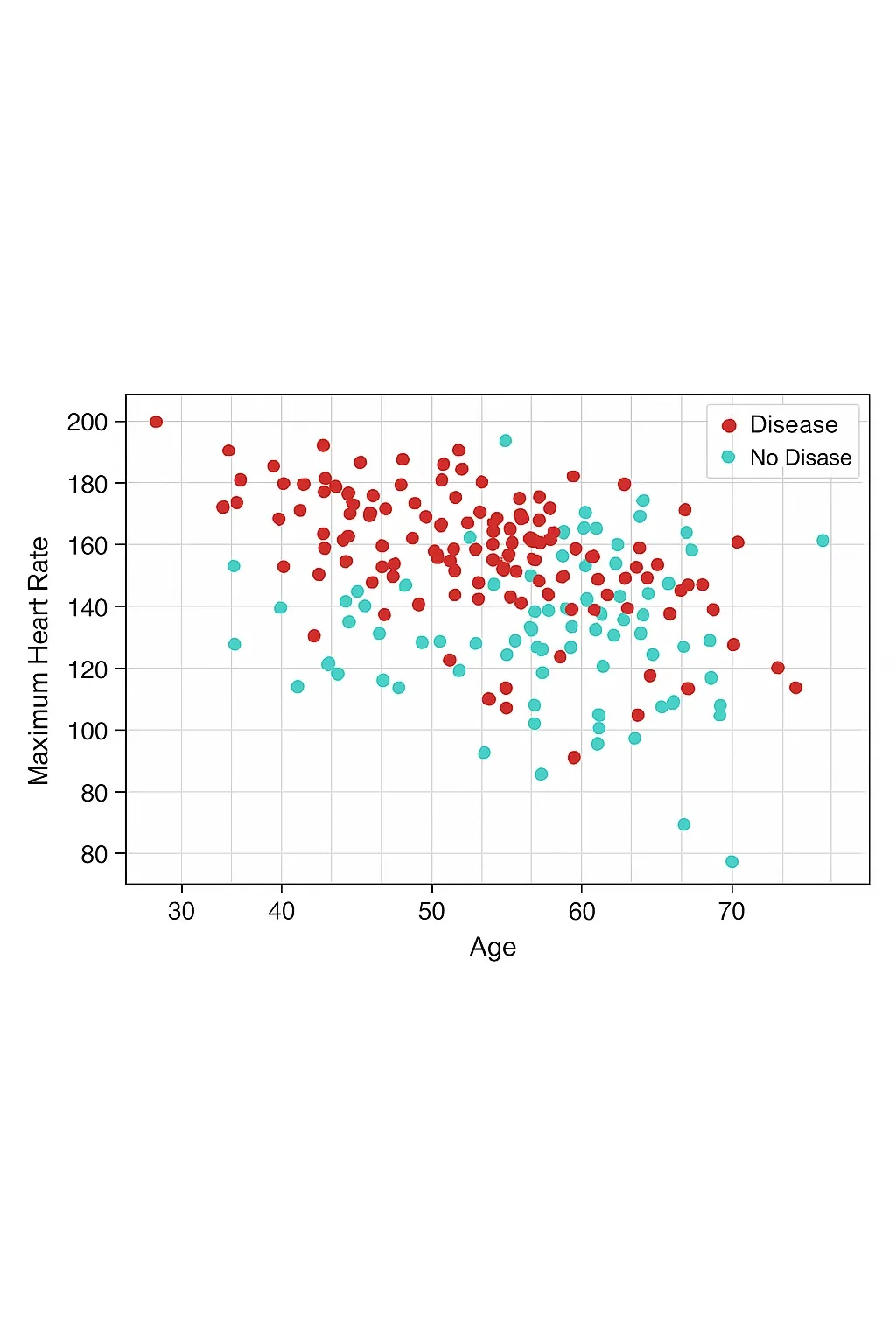
There is a point with age ~30 and heart rate ~200 bpm. In this dataset, higher maximum heart rates among diseased subjects are broadly concentrated in the 140–200 bpm range compared with non-diseased subjects. The violin plot shows the distribution of resting blood pressure by disease status.
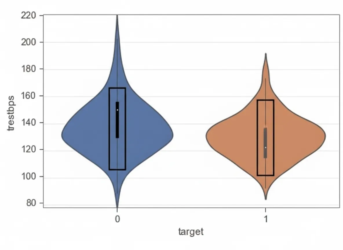
Age and resting blood pressure
Does resting blood pressure (trestbps) vary with age or disease status?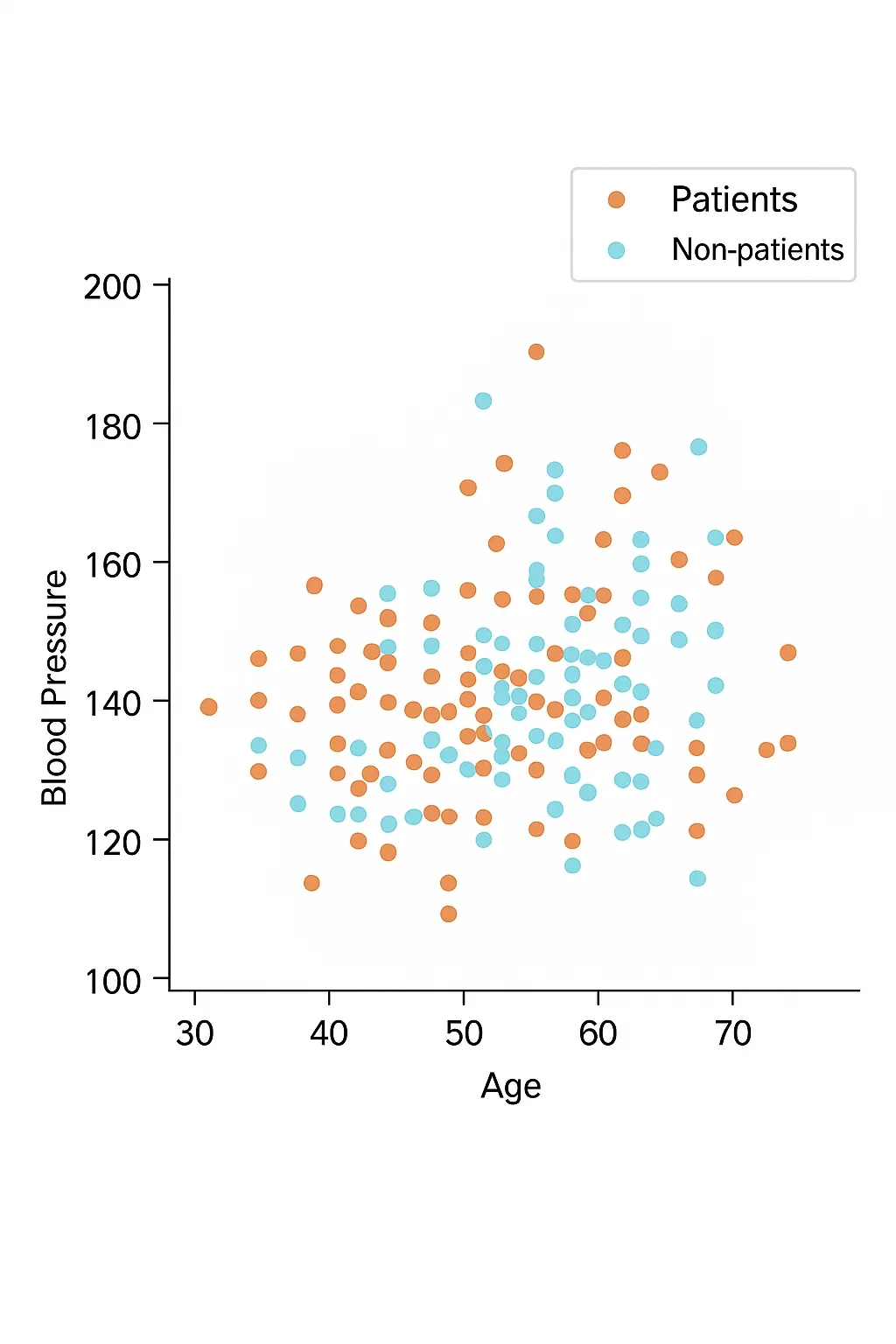
In this sample, resting blood pressure shows an approximately uniform distribution across ages for both diseased and non-diseased subjects. Resting blood pressure alone does not provide a clear separation for disease presence here.
Resting blood pressure and maximum heart rate
Compare blood pressure and maximum heart rate, which are analogous to engine power and engine speed.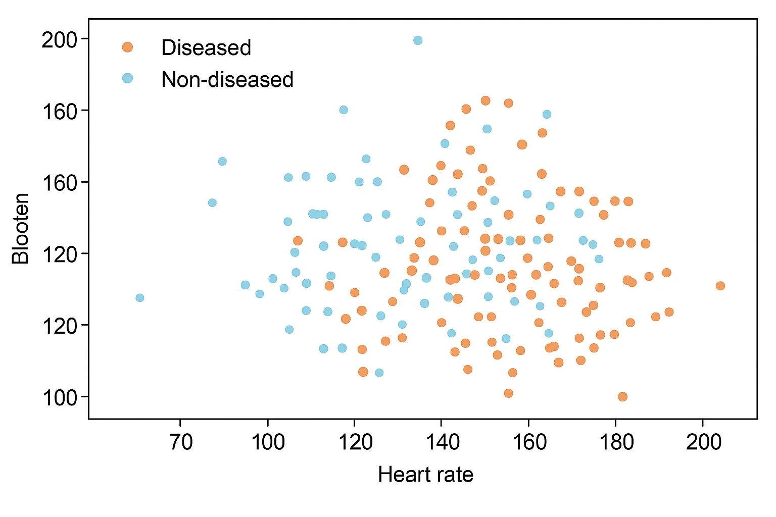
In this sample there is no clear correlation between resting blood pressure and maximum heart rate beyond the higher disease rate already observed.
Chest pain type, disease, and blood pressure
The cp field encodes chest pain type. Visualize its relationship with disease and resting blood pressure.
From the plots, cp=0 chest pain type predominates among non-diseased subjects, while cp values 1, 2, and 3 are more common among diseased subjects in this dataset. Note that the dataset uses values 0–3 for cp; mappings between documented labels and dataset values should be confirmed in source documentation.
Exercise-induced angina, disease, and heart rate
Assess whether exercise-induced angina (exang: 1 = yes, 0 = no) relates to disease and maximum heart rate.
The plot shows that subjects without exercise-induced angina often have maximum heart rates concentrated around 160–180 bpm and many of those are diseased in this sample. One plausible interpretation is that diseased subjects may avoid strenuous exercise, reducing observed exercise-induced angina, while subjects who do experience exercise-induced angina may include many with higher heart rates who are not diseased.
Number of major vessels and resting blood pressure
The ca field refers to the number of major vessels visible on fluoroscopy. In this dataset, ca correlates strongly with disease presence for ca=0.
Age and cholesterol
Compare age, cholesterol, and disease status.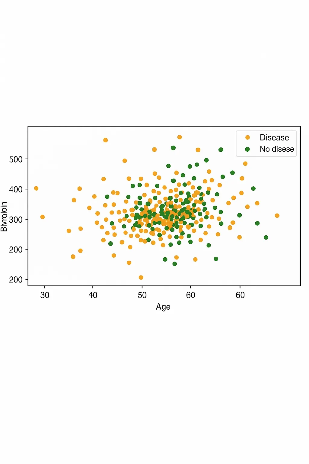
In this sample, cholesterol distributions for diseased and non-diseased subjects show no strong separation. Box plots indicate similar ranges and quartiles, with diseased subjects slightly lower on some percentiles.
Conclusion: cholesterol does not directly indicate heart disease status in this dataset.
Correlation analysis
Compute the correlation matrix to identify variables most associated with disease. Green indicates stronger positive correlation, red indicates stronger negative correlation.
plt.figure(figsize=(15,10)) ax = sns.heatmap(data.corr(), cmap=plt.cm.RdYlBu_r, annot=True, fmt='.2f') a, b = ax.get_ylim() ax.set_ylim(a+0.5, b-0.5)
From the correlation matrix, target (disease) shows positive correlation with cp, thalach, and slope, and negative correlation with exang, oldpeak, ca, and thal.
This article presents exploratory visual analysis of the heart disease dataset. There are many additional variable combinations and modeling approaches possible. The analysis here is limited to visualization and summary, without predictive modeling.
The code used for this analysis has been published for reproducibility.