ALLPCB


When it comes to designing a printed circuit board (PCB), every detail matters. One often-overlooked aspect is the silkscreen layer—the markings on the board that provide critical information like component labels, polarity indicators, and version numbers. But how do you ensure these markings are clear and easy to read? The answer lies in optimizing silkscreen color contrast against the PCB solder mask color. Poor contrast can lead to unreadable markings, causing errors during assembly or maintenance. In this blog, we’ll dive deep into silkscreen readability, PCB markings visibility, and silkscreen design for clarity, offering practical tips to ensure your designs are both functional and professional.
What Is Silkscreen in PCB Design?
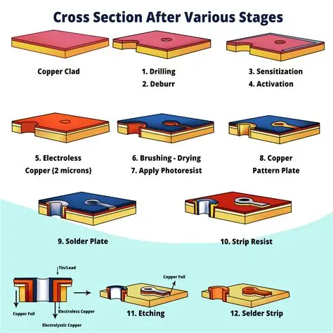
Before we explore color contrast, let’s define what silkscreen is in the context of PCB manufacturing. The silkscreen layer is a non-conductive ink applied to the surface of a PCB. It typically includes text, symbols, and markings that help identify components, indicate polarity, mark test points, and provide other essential information for assembly and troubleshooting. This layer is crucial for anyone working with the board, from engineers to assembly technicians.
While the silkscreen itself doesn’t impact the electrical performance of the PCB, its clarity directly affects usability. If the markings are hard to read due to poor color contrast or placement, mistakes can occur, leading to costly delays or rework. That’s why optimizing silkscreen color contrast and design is a key step in creating a high-quality PCB.
Why Silkscreen Color Contrast Matters for PCB Markings Visibility
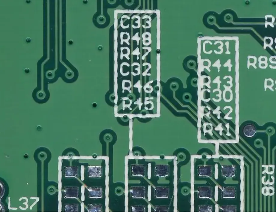
Silkscreen color contrast refers to how well the silkscreen ink stands out against the underlying solder mask color. The solder mask is the protective layer covering the copper traces on a PCB, and it comes in various colors like green, blue, red, black, or white. If the silkscreen color blends into the solder mask, the markings become difficult to read, especially under poor lighting conditions or during high-speed assembly processes.
For example, using a white silkscreen on a white solder mask creates almost no contrast, rendering the markings nearly invisible. On the other hand, pairing a white silkscreen with a dark green or black solder mask offers excellent readability. High contrast ensures that PCB markings visibility is maintained, reducing errors during component placement or troubleshooting.
Good silkscreen readability also enhances traceability. Markings like serial numbers or version identifiers are often used to track boards through production. If these are unreadable, it can lead to mix-ups or delays. Prioritizing contrast in silkscreen design for clarity is not just about aesthetics—it’s about functionality and efficiency.
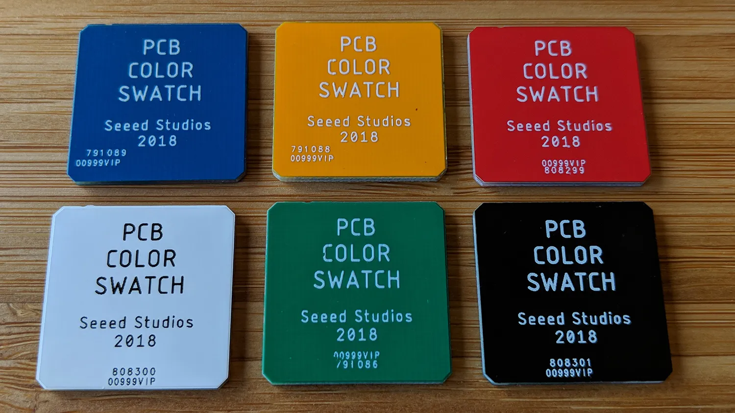
Common Solder Mask and Silkscreen Color Combinations
Choosing the right combination of solder mask and silkscreen colors is the foundation of optimizing contrast. Here are some of the most common pairings and their impact on readability:
- Green Solder Mask with White Silkscreen: This is the most traditional and widely used combination. The bright white ink stands out sharply against the dark green background, ensuring excellent silkscreen readability. It’s a safe choice for most applications, especially in industrial and consumer electronics.
- Blue Solder Mask with White Silkscreen: Similar to green, a blue solder mask provides a dark background for white ink to pop. This combination is often used in designs where a slightly different aesthetic is desired while maintaining high PCB markings visibility.
- Black Solder Mask with White Silkscreen: Black offers one of the highest contrast options when paired with white silkscreen. It’s ideal for designs where clarity is paramount, though black solder masks can sometimes absorb more heat during soldering, so consider this in thermal-sensitive designs.
- Red Solder Mask with White Silkscreen: Red solder masks are less common but can provide good contrast with white ink. However, the contrast may not be as sharp as with darker colors like green or black, especially under certain lighting conditions.
- White Solder Mask with Black Silkscreen: For lighter solder masks like white, black silkscreen ink offers the best contrast. This pairing is often seen in designs aiming for a clean, modern look, but white solder masks can show dirt or scratches more easily.
While white and black are the most common silkscreen colors due to their versatility, other colors like yellow can be used in specific cases. Yellow silkscreen might stand out on a black or dark blue solder mask but may not provide the same level of universal readability as white or black.
Factors Affecting Silkscreen Readability Beyond Color Contrast
While silkscreen color contrast is critical, other factors also play a role in ensuring PCB markings visibility and overall silkscreen design for clarity. Let’s explore these elements in detail:
1. Font Size and Style
The size and style of the text used in the silkscreen layer significantly impact readability. Industry standards, such as those from the Institute of Printed Circuits (IPC), recommend a minimum font size to ensure legibility after manufacturing processes like soldering. A common guideline is to use text no smaller than 6 mils (0.006 inches) in height. Additionally, avoid overly stylized or complex fonts—stick to simple, sans-serif styles for maximum clarity.
2. Placement of Markings
Where you place silkscreen markings on the PCB matters just as much as their color. Avoid placing text over copper pads, vias, or areas where components will cover the markings. IPC-2221 guidelines suggest maintaining a minimum clearance between silkscreen and conductive features to prevent manufacturing defects or obscured text. For example, a clearance of at least 10 mils (0.010 inches) around pads is often recommended.
3. Ink Quality and Application Method
The quality of the silkscreen ink and the method used to apply it can affect durability and readability. Most silkscreen inks are non-conductive epoxy-based formulations designed to withstand soldering temperatures and environmental stress. Traditional screen printing is the most common method, but advanced techniques like digital printing can offer finer details for complex designs. Ensure that the ink adheres well to the solder mask to avoid fading or smudging over time.
4. Lighting Conditions and Environment
The environment where the PCB will be used or assembled can influence silkscreen readability. For instance, in low-light settings, high contrast becomes even more important. If the board will be exposed to harsh conditions like high humidity or UV light, choose a silkscreen ink and solder mask color that resist fading or discoloration.
Best Practices for Silkscreen Design for Clarity
Now that we’ve covered the importance of silkscreen color contrast and other factors, let’s dive into actionable best practices to optimize your silkscreen design for clarity and ensure high PCB markings visibility:
- Test Color Combinations: Before finalizing your design, test different solder mask and silkscreen color pairings under various lighting conditions. If possible, request a prototype from your manufacturer to see how the contrast holds up in real-world scenarios.
- Follow Industry Standards: Adhere to IPC guidelines like IPC-A-600 for legibility and IPC-7351 for standard component footprints and markings. These standards ensure compatibility with manufacturing processes and help maintain readability after production.
- Prioritize Key Information: Not all markings are equally important. Focus on making critical information like polarity indicators and component reference designators highly visible. Use larger text or bolder lines for these elements if needed.
- Use Color for Traceability: Beyond contrast, consider using different silkscreen colors for specific purposes, such as highlighting version numbers or serial codes. This can improve traceability during production and maintenance, especially for complex projects.
- Work Closely with Your Manufacturer: Different manufacturers may have varying capabilities when it comes to silkscreen colors and application methods. Confirm color availability and discuss any design constraints early in the process to avoid surprises.
Challenges in Achieving Optimal Silkscreen Color Contrast
While optimizing silkscreen color contrast seems straightforward, there are challenges to consider. For one, not all manufacturers offer a wide range of silkscreen colors beyond the standard white and black. Custom colors may come at an additional cost or lead time. Additionally, certain solder mask colors, like yellow or white, can be less forgiving when it comes to showing imperfections or dirt, which might detract from the overall appearance of the markings over time.
Another challenge is balancing aesthetics with functionality. While a unique color combination might look appealing for branding purposes, it could compromise readability if the contrast isn’t sufficient. Always prioritize function over form when it comes to silkscreen design for clarity.
How Silkscreen Readability Impacts PCB Manufacturing and Assembly
The impact of silkscreen readability extends beyond design—it plays a direct role in manufacturing and assembly efficiency. During assembly, technicians rely on clear markings to place components correctly. For example, polarity indicators for diodes or capacitors must be unmistakable to prevent reverse installation, which could damage the board or connected components.
In automated assembly lines, optical inspection systems often scan silkscreen markings to verify component placement. If the contrast is poor, these systems may struggle to read the markings, leading to false errors or missed defects. According to industry data, assembly errors due to unreadable markings can increase rework costs by up to 15-20% in high-volume production runs. Investing in proper silkscreen color contrast can save significant time and money in the long run.

Conclusion: Mastering Silkscreen Color Contrast for Better PCBs
Optimizing silkscreen color contrast is a small but crucial step in creating PCBs that are easy to assemble, troubleshoot, and maintain. By carefully selecting solder mask and silkscreen color combinations, adhering to industry standards, and following best practices for silkscreen design for clarity, you can ensure high PCB markings visibility and silkscreen readability. Whether you’re designing for consumer electronics or industrial applications, clear markings reduce errors, improve traceability, and enhance the overall quality of your product.
Take the time to test different combinations, prioritize critical information, and collaborate with your manufacturing partner to achieve the best results. A well-designed silkscreen layer isn’t just a finishing touch—it’s a vital component of a successful PCB design. With the right approach, you can avoid the pitfalls of a silkscreen color clash and create boards that are as functional as they are professional.