ALLPCB


Introduction
Machine learning models have powerful and often complex mathematical structures. Understanding their intricate working principles is an important part of model development. Model visualization is essential for gaining insight, making informed decisions, and communicating results effectively.
This article examines the practice of visualizing machine learning, exploring techniques that help us understand data-driven systems. At the end, a practical visualization code example is provided.
What is visualization in machine learning?
Machine learning visualization, or ML visualization, refers to the graphical or interactive representation of models, data, and their relationships. The goal is to make algorithms and data patterns easier to understand for both technical and non-technical stakeholders.
Visualization bridges the gap between the internal operations of ML models and our ability to perceive patterns visually.
Main purposes of ML visualization
- Model structure visualization: Common model types such as decision trees, support vector machines, or deep neural networks often consist of many computational layers and interactions that are difficult for humans to grasp. Visualization helps reveal how data flows through a model and where transformations occur.
- Visualizing performance metrics: After training a model, we need to evaluate its performance. Visualizing metrics like accuracy, precision, recall, and F1 score helps identify how a model performs and where it needs improvement.
- Comparative model analysis: When working with multiple models or algorithms, visualizing structural or performance differences helps choose the most suitable model for a task.
- Feature importance: Knowing which features most influence a model's predictions is critical. Visualizations such as feature importance plots make it easy to identify key factors driving model outcomes.
- Interpretability: Because many ML models act as "black boxes," visualization can clarify how specific features affect outputs or the robustness of predictions.
- Communication: Visuals provide an intuitive language for conveying complex ideas to managers and other non-technical stakeholders.
Model structure visualization
Understanding how data flows through a model is vital to grasping how input features are transformed into outputs.
Decision tree visualization
Decision trees have a flowchart-like structure familiar to many. Each internal node represents a decision based on a specific feature value, each branch represents an outcome of that decision, and leaf nodes represent model outputs.
Visualizing this structure gives a direct representation of the decision process, helping practitioners and business stakeholders understand the rules the model has learned.
During training, a decision tree selects features that best split samples at nodes according to criteria such as Gini impurity or information gain. In other words, it identifies the most discriminative features.
Visualizing a decision tree, or forests of trees such as random forests or gradient-boosted trees, involves rendering the tree structure to show splits and decisions clearly. Tree depth, width, and leaf nodes become immediately apparent, and visualizations help identify features that drive accurate predictions.
Paths that lead to accurate predictions can be summarized in four steps:
- Feature clarity: Decision tree visualization peels away layers of complexity to reveal key features. It resembles a flowchart where each branch corresponds to a feature and each node captures a key aspect of the data.
- Discriminative attributes: Visualizations highlight the most discriminative features that strongly influence outcomes. By inspecting the tree, those core drivers of model decisions become apparent.
- Paths to accuracy: Each path through a decision tree represents a sequence of decisions that leads to a specific prediction. Visualization exposes the logic and thresholds used to reach conclusions.
- Simplicity within complexity: Although ML algorithms can be complex, decision tree visualizations translate mathematical operations into intuitive representations accessible to both technical and non-technical audiences.

The image above shows the structure of a decision tree classifier trained on the Iris dataset. The dataset contains 150 iris samples, each belonging to one of three species: setosa, versicolor, or virginica. Each sample has four features: sepal length, sepal width, petal length, and petal width.
From the decision tree visualization, one can see how the model classifies flowers:
- Root split: At the root, the model checks whether petal length is 2.45 cm or less. If true, the sample is classified as setosa; otherwise the tree proceeds to another internal node.
- Second split on petal length: If petal length is greater than 2.45 cm, the tree again uses petal length to decide, with a threshold of 4.75 cm.
- Split on petal width: If petal length is less than or equal to 4.75 cm, the model examines petal width and checks whether it is greater than 1.65 cm. If true, the sample is classified as virginica; otherwise the model outputs versicolor.
- Split on sepal length: If petal length is greater than 4.75 cm, the model uses sepal length to distinguish versicolor from virginica. If sepal length is greater than 6.05 cm, classify as virginica; otherwise classify as versicolor.
The visualization captures this hierarchical decision process in a more intuitive form than a list of rules.
Ensemble model visualization
Ensemble methods such as random forests, AdaBoost, gradient boosting, and bagging combine multiple simpler models (base estimators) into a larger, more accurate model. For example, a random forest classifier contains many decision trees. When debugging and evaluating ensembles, it is useful to understand the contributions and complex interactions of constituent models.
One way to visualize ensembles is to plot how each base model contributes to the ensemble output. A common approach is to draw decision boundaries for base models, highlighting their influence in different regions of feature space. Studying how these boundaries overlap helps explain the ensemble's collective prediction behavior.
Visualization of ensembles also helps understand weight assignment across base models. Some base models may strongly influence certain regions of feature space, while contributing little elsewhere. Identifying models with unusually low or high weights can help make the ensemble more robust and improve generalization.
Visual model building
Visual ML refers to designing machine learning models using low-code or no-code platforms. These platforms let users create and modify complex workflows, models, and outputs through user-friendly visual interfaces, placing visualization at the center of the ML workflow.
In short, Visual ML platforms provide drag-and-drop model building that allows users from diverse backgrounds to assemble ML models. They bridge the abstract world of algorithms and our innate ability to reason visually about patterns and relationships.
Such platforms can speed up prototyping and make it easy to train and compare different model configurations within minutes. High-performing models can then be further optimized, possibly via more code-centric approaches.
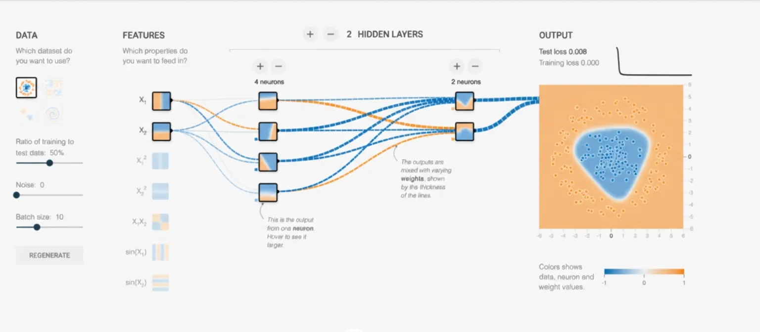
Examples of Visual ML tools include TensorFlow's Neural Network Playground and KNIME, an open-source data science platform built around visual and no-code concepts.
Visualizing machine learning model performance
Often the internal workings of a model are less important than how well it performs. Which samples are reliable? Where does it often make mistakes? Should we pick model A or model B?
This section covers visualizations that help understand model performance.
Confusion matrix
A confusion matrix is a fundamental tool for evaluating classification models. It compares model predictions to ground truth and clearly shows which classes the model confuses or has difficulty distinguishing.
For a binary classifier, the confusion matrix has four fields: true positive, false positive, false negative, and true negative.
From these values, basic metrics such as precision, recall, F1 score, and accuracy can be calculated.
Multiclass confusion matrices follow the same concept. Diagonal elements represent correctly classified instances, while off-diagonal entries indicate misclassifications.
Here is a short snippet that generates a confusion matrix for a scikit-learn classifier:
import matplotlib.pyplot as plt
from sklearn.datasets import make_classification
from sklearn.metrics import confusion_matrix, ConfusionMatrixDisplay
from sklearn.model_selection import train_test_split
from sklearn.svm import SVC
# generate some sample data
X, y = make_classification(n_samples=1000,
                           n_features=10,
                           n_informative=6,
                           n_redundant=2,
                           n_repeated=2,
                           n_classes=6,
                           n_clusters_per_class=1,
                           random_state=42)
# split the data into train and test set
X_train, X_test, y_train, y_test = train_test_split(X, y, random_state=0)
# initialize and train a classifier
clf = SVC(random_state=0)
clf.fit(X_train, y_train)
# get the model’s prediction for the test set
predictions = clf.predict(X_test)
# using the model’s prediction and the true value,
# create a confusion matrix
cm = confusion_matrix(y_test, predictions, labels=clf.classes_)
# use the built-in visualization function to generate a plot
disp = ConfusionMatrixDisplay(confusion_matrix=cm, display_labels=clf.classes_)
disp.plot()
plt.show()
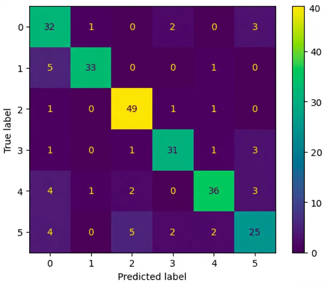
Observe the output: diagonal elements represent true classes, and off-diagonal elements show where the model confuses classes.
Three key points from the figure:
- Diagonal dominance: Ideally, the main diagonal should contain the largest numbers, indicating correct predictions for each class.
- Off-diagonal entries: Non-diagonal cells reveal where the model errs. For example, an entry at row 5 column 3 indicates samples whose true class is 5 but predicted as 3. Investigating those samples helps diagnose issues.
- Normalized vs. absolute counts: Visual cues such as very low off-diagonal values suggest good performance. In many real-world cases, class imbalance complicates interpretation. Creating a second confusion matrix that shows class-wise probabilities instead of absolute counts can be helpful.
Visual enhancements such as color gradients and percentage annotations make confusion matrices more intuitive and guide further model development.
Visualizing clustering analysis
Clustering groups similar data points by features. Visualizing clusters can reveal patterns, trends, and relationships.
A standard method is to color points in a scatter plot by cluster assignment. Cluster boundaries and their distribution in feature space become clear. Pair plots or parallel coordinates help explore relationships across multiple features.
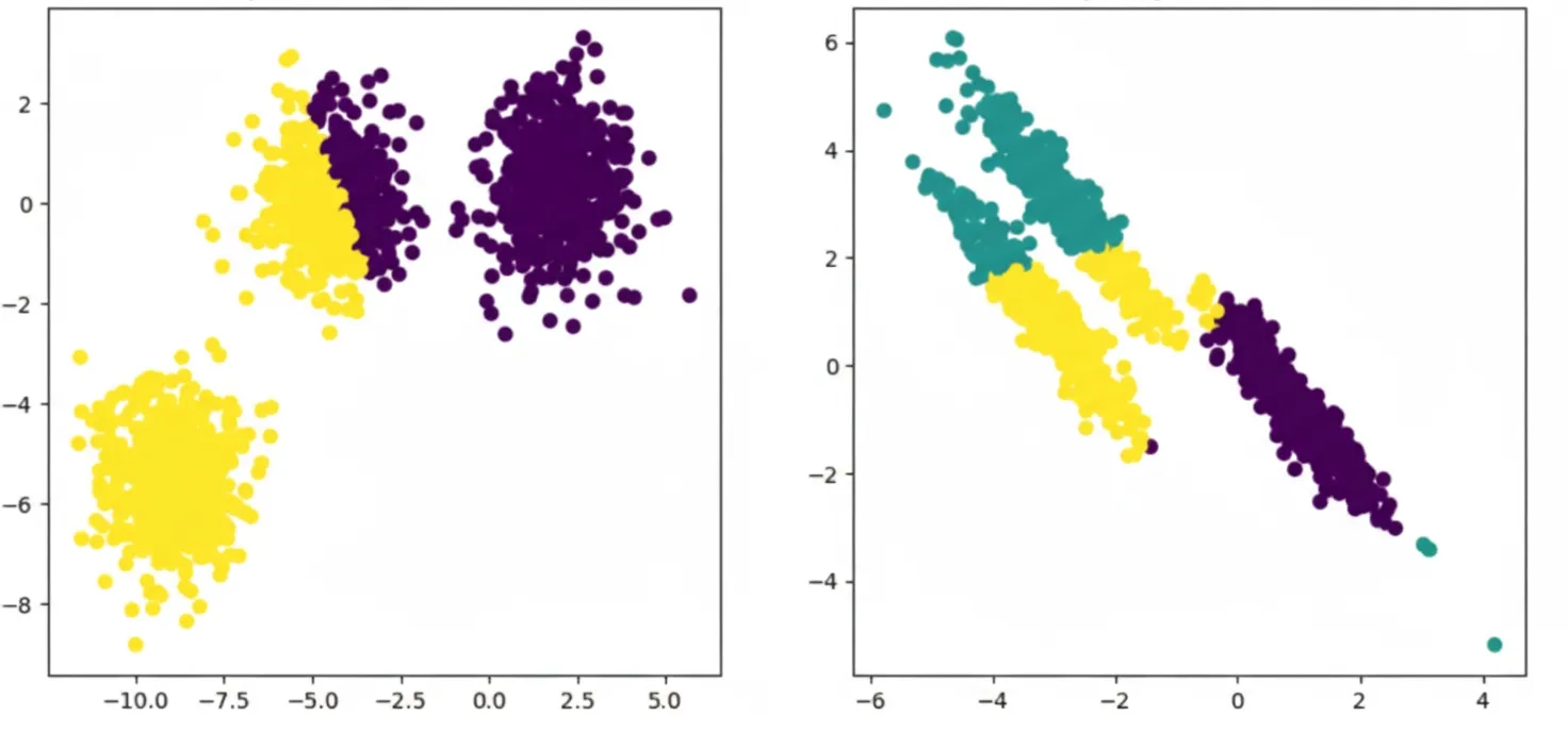
One popular clustering algorithm, k-means, starts by choosing initial centroids, often by randomly selecting k samples.
Once initial centroids are set, k-means alternates between two steps:
- Assign each sample to the nearest centroid, forming clusters of samples associated with the same centroid.
- Recompute centroids by averaging all samples in each cluster.
As iterations proceed, centroids move and associations refine. When centroid shifts fall below a threshold, the algorithm converges.
The result is a set of centroids and clusters that can be visualized as shown above.
For larger or high-dimensional datasets, dimensionality reduction methods such as t-SNE or UMAP preserve clustering structure while enabling visualization.
t-SNE transforms complex high-dimensional data into a low-dimensional representation. It places points in a low-dimensional space so that neighbors in the original space remain close, while dissimilar points are pushed apart. Iterative optimization continues until points stabilize, producing a visualization where similar points form clusters.

UMAP also seeks clusters in high-dimensional space but follows a different approach:
- Neighbor search: UMAP identifies each point's nearest neighbors in the original space.
- Fuzzy simplicial set construction: It models the strength of connections between neighboring points based on similarity.
- Low-dimensional layout: UMAP arranges points in a low-dimensional space so that closely connected high-dimensional points are placed near each other.
- Optimization: UMAP minimizes the difference between high-dimensional and low-dimensional distances to find a good representation.
- Clustering: UMAP representations can be clustered to group similar points for clearer structure visualization.
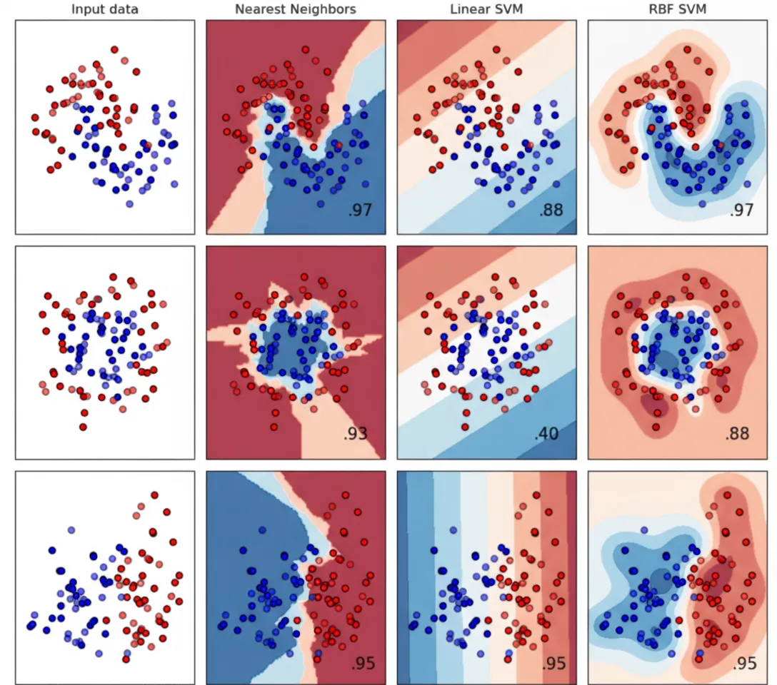
Comparative model analysis
Comparing model performance metrics is crucial for selecting the best model for a task. During experiments or retraining, visualizations convert complex numeric results into actionable insights.
Visuals such as ROC curves and calibration plots are essential tools for data scientists and ML engineers. They form the basis for understanding and communicating model effectiveness.
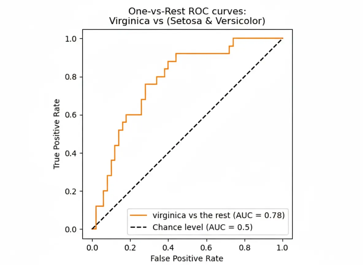
ROC curve
The Receiver Operating Characteristic (ROC) curve is key when analyzing classifiers and comparing model performance.
ROC plots the true positive rate against the false positive rate as the decision threshold varies. It shows the trade-off between true positives and false positives and provides insight into a model's discriminative ability.
Curves close to the top-left indicate strong performance: high true positive rate with low false positive rate. Comparing ROC curves helps select the best model.
How ROC works, step by step:
- In binary classification, the goal is to predict one of two outcomes labeled positive or negative.
- Any classification problem can be converted to binary by treating one class as positive and the rest as negative, so ROC is also useful for multiclass or multilabel problems.
- ROC axes represent:
- True positive rate (sensitivity): fraction of actual positives correctly identified.
- False positive rate: fraction of actual negatives incorrectly labeled positive.
- Classifiers often output probabilities or scores between 0 and 1, which can be interpreted as likelihoods.
- Choosing a threshold above which samples are assigned to the positive class affects performance; ROC shows how this choice changes true and false positive rates.
If the threshold is 0, all samples are labeled positive and the false positive rate is 1, so ROC curves end at (1, 1). If the threshold is 1, no samples are labeled positive and the false positive rate is 0, so ROC curves start at (0, 0). Varying the threshold traces the ROC curve between these points.
The ROC curve highlights trade-offs between sensitivity and specificity. A perfect classifier has TPR 1 and FPR 0 for all thresholds, so its ROC moves from (0,0) to (0,1) and then to (1,1).
To compare models quantitatively, we compute the area under the ROC curve (ROC-AUC), which ranges from 0 to 1. A perfect classifier achieves ROC-AUC of 1. The baseline for a random classifier is 0.5, corresponding to the diagonal from (0,0) to (1,1).
Generating ROC curves and ROC-AUC with scikit-learn is straightforward. Recording these metrics during experiments makes it easy to compare model versions later.
Example code for computing and recording ROC-AUC and plotting ROC:
# Compute and log ROC-AUC
from sklearn.metrics import roc_auc_score
clf.fit(x_train, y_train)
y_test_pred = clf.predict_proba(x_test)
auc = roc_auc_score(y_test, y_test_pred[:, 1])
# optional: log to an experiment-tracker like neptune.ai
neptune_logger.run["roc_auc_score"].append(auc)
# Create and log ROC plot
from scikitplot.metrics import plot_roc
import matplotlib.pyplot as plt
fig, ax = plt.subplots(figsize=(16, 12))
plot_roc(y_test, y_test_pred, ax=ax)
# optional: log to an experiment tracker like neptune.ai
from neptune.types import File
neptune_logger.run["roc_curve"].upload(File.as_html(fig))
Calibration curve
Although classifiers often output values between 0 and 1, these values do not always reflect calibrated probabilities or confidence. If reporting confidence levels is required, classifier calibration must be checked. Calibration plots are useful for assessing whether predicted probabilities correspond to observed frequencies.
Calibration plots show the conditional probability that a sample belongs to the positive class given the model output. A perfectly calibrated model lies on the diagonal: predicted probabilities equal observed frequencies.
For example, a naive Bayes classifier might output 0 but the true probability of the positive class could be around 10%. If the model outputs 0.8, the actual positive rate may still be 50%. In such cases, the model's outputs do not reflect reliable probabilities.
Computing calibration curves requires grouping outputs into bins because model outputs are not uniformly distributed. For instance, logistic regression often yields many predictions near 0 or 1 and few near 0.5. See scikit-learn documentation for calibration techniques and recalibration methods.
Calibration plots provide a compact way to visualize whether a model is well calibrated and compare models against the ideal diagonal.
Visualizing hyperparameter optimization
Hyperparameter optimization is a key step in developing ML models. Hyperparameters are predefined by humans rather than learned by the model. Visualization helps understand the effect of different hyperparameters on model performance and behavior.
A common approach is grid search: enumerate candidate parameter combinations and train a model for each combination using cross-validation.
For example, for an SVM you might explore ranges for C (regularization) and gamma (kernel coefficient):
import numpy as np
C_range = np.logspace(-2, 10, 13)
gamma_range = np.logspace(-9, 3, 13)
param_grid = {"gamma": gamma_range, "C": C_range}
Using scikit-learn's GridSearchCV, train models for each combination and select the best based on an evaluation metric:
from sklearn.model_selection import GridSearchCV
grid = GridSearchCV(SVC(), param_grid=param_grid, scoring='accuracy')
grid.fit(X, y)
After grid search completes, inspect results:
print(
"The best parameters are %s with a score of %0.2f"
% (grid.best_params_, grid.best_score_)
)
Beyond finding the best combination, visualizations of grid search results reveal each parameter's impact. If a parameter does not influence performance, further tuning is unnecessary. If performance improves with larger values, a wider search may be warranted.
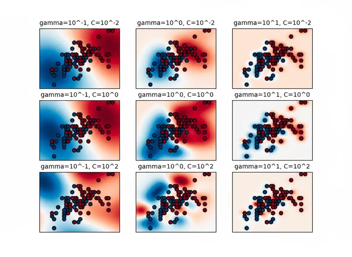
The example shows that gamma strongly affects SVM performance. Too large a gamma yields small influence radii for support vectors, which can cause overfitting. The best models often lie along a diagonal in the C-gamma space, where balancing gamma (smoother models at lower values) and higher C (stronger emphasis on correct classification) yields good performance.
Visualizations are valuable for understanding why performance varies across hyperparameter configurations, which is why experiment-tracking tools support diverse visual analyses.
Feature importance visualization
Feature importance visualizations clarify each input feature's contribution to model decisions. In many applications, identifying features that significantly influence predictions is essential.
Methods to extract feature importance vary. Broadly, they fall into two categories:
- Model-intrinsic methods: Some models, such as decision trees and random forests, provide feature importance as part of their structure. These values can be extracted and visualized directly.
- Model-agnostic methods: Many models do not provide built-in importance measures. Statistical or algorithmic techniques are used to quantify each feature's effect on model output.
This article highlights two examples: mean decrease in impurity from random forests and the model-agnostic LIME method. Other techniques worth exploring include permutation importance, SHAP, and integrated gradients.
For visualization, bar charts are common for structured data, with bar length indicating importance. Heatmaps suit image features, and highlighted words or phrases work well for text data.
In business settings, feature importance plots communicate which factors drive predictions, supporting transparency and stakeholder discussion.
Mean decrease in impurity for feature importance
Mean decrease in impurity measures how much each feature contributes to reducing impurity across tree nodes. To understand this, consider an analogy:
Imagine a basket of mixed fruit: apples, pears, and oranges. When mixed together, impurity is high.
If we sort fruits by type into separate containers, impurity is reduced to near zero.
Now suppose we cannot see fruits directly but only their color, diameter, and weight. These attributes serve as features.
Color might be highly informative for distinguishing oranges from apples, while weight and diameter may be less helpful.
In decision trees, each split aims to increase purity with respect to the target variable. Features that frequently and effectively split samples into purer subsets account for larger portions of total impurity reduction, making mean decrease in impurity a useful importance metric.
Visualizing mean decrease in impurity makes it easy to spot the main drivers of model decisions and can guide feature selection to reduce complexity and overfitting.
Be cautious: since impurity reductions are computed on training data, a feature with high importance could reflect a data artifact, such as a unique sample identifier that only appears in training data and does not generalize.
Local Interpretable Model-Agnostic Explanations (LIME)
Local interpretability methods aim to explain model behavior for specific instances, as opposed to global interpretability, which examines behavior across the entire feature space.
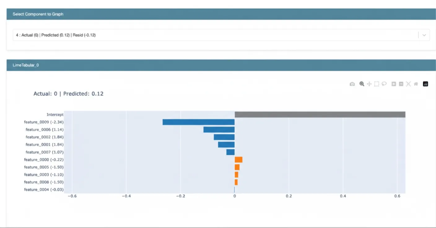
LIME fits a simple interpretable model, such as a linear model, to approximate the complex model's behavior in the neighborhood of a specific instance. The linear model's coefficients indicate feature contributions for that prediction. Visualizing these local explanations highlights which features were most influential for an individual prediction.
Local interpretability provides actionable insights from complex algorithms, supports discussions with business stakeholders, and enables cross-checking behavior with domain experts.
Adopting model visualization in practice
Below are practical tips for integrating model visualization into everyday data science and ML routines.
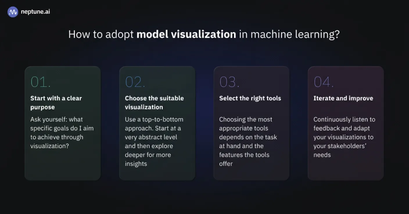
1. Start with clear objectives
Before diving into visualization, define a clear purpose. Ask: what specific goals will this visualization achieve? Are you trying to improve performance, enhance interpretability, or communicate results to stakeholders? Clear goals guide effective visualization choices.
2. Choose appropriate visualizations
Use a top-down approach: start with abstract, high-level views and drill down for more detail. For performance issues, begin with simple line plots of accuracy and loss. If overfitting is suspected, inspect feature importance and partial dependence plots (PDPs). PDPs show how predictions vary with a single feature while holding others constant; unstable curves may signal overfitting.
3. Select the right tools
Tool choice depends on the task. Python offers libraries like Matplotlib, Seaborn, and Plotly for static and interactive visuals. Framework-specific tools such as TensorBoard for TensorFlow and scikit-plot for scikit-learn are useful for model-specific visualizations.
4. Iterate and refine
Visualization is iterative. Refine visuals based on feedback from the team and stakeholders. The goal is to make models transparent, interpretable, and accessible. Stakeholder input and evolving project needs may require revisiting visualization strategies.
Integrating visualization into regular ML practice enables clearer, more confident data-driven decisions. Whether you are a data scientist, domain expert, or decision-maker, making model visualization a routine helps realize ML project potential.
Summary
Effective visualization of machine learning models is an essential tool for data practitioners. It enables insight, informed decision-making, and transparent communication.
This article covered a range of visualization topics. Key takeaways:
- Purpose: Visualization simplifies complex ML model structures and data patterns for better understanding.
- Types: Model structure visualizations help practitioners and stakeholders understand algorithms and data flow.
- Practice: Start with clear objectives and simple visualizations, then iterate and deepen analysis.