ALLPCB


If you're looking to improve the readability of black silkscreen on PCBs and achieve high contrast, the key lies in optimizing the solder mask color, choosing the right silkscreen ink types, and following essential PCB design tips. High contrast silkscreen PCB design ensures clear labeling for components, polarity markers, and assembly instructions, making boards easier to assemble and troubleshoot. In this comprehensive guide, we'll dive deep into actionable strategies for enhancing black silkscreen readability, exploring solder mask color contrast, ink options, and best practices for design.
Why High Contrast Silkscreen Matters in PCB Design
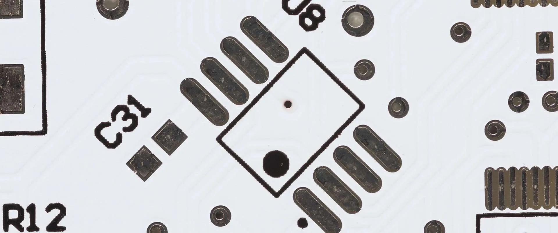
In PCB manufacturing, the silkscreen layer—often called the legend layer—plays a critical role in providing visual information on the board. This layer includes labels for components (like "R1" for a resistor), polarity indicators, test points, and other markings that guide assembly and maintenance. When using black silkscreen, achieving high contrast against the solder mask is essential for readability, especially under varying lighting conditions or during fast-paced assembly processes.
Poor contrast can lead to misinterpretation of markings, resulting in assembly errors or delays in troubleshooting. For instance, if a black silkscreen blends into a dark solder mask, technicians may struggle to identify component orientations, costing time and risking mistakes. By optimizing contrast, you ensure that your PCB is user-friendly and efficient to work with, ultimately saving resources and improving reliability.
Understanding Black Silkscreen Readability Challenges
Black silkscreen is a popular choice for many PCB designs due to its clean, professional appearance. However, it poses unique challenges when it comes to readability. Unlike white silkscreen, which naturally contrasts well against most dark solder masks, black silkscreen can easily blend into the background if the solder mask color isn't carefully chosen.
The primary challenge is ensuring that the black ink stands out against the underlying solder mask. If the mask is too dark—such as a deep green or black—labels may become nearly invisible without ideal lighting. This issue is compounded in environments where glare or shadows are common, such as manufacturing floors or repair shops. Additionally, the thickness and quality of the silkscreen ink can impact readability, as thin or uneven application may cause labels to fade or smudge over time.
Choosing the Right Solder Mask Color for High Contrast with Black Silkscreen
The solder mask is the protective layer applied over the copper traces of a PCB, and its color significantly affects silkscreen readability. To achieve high contrast with black silkscreen, selecting a lighter or complementary solder mask color is crucial. Here are some popular options and their effects on contrast:
- Green Solder Mask: Traditional green masks, especially lighter shades, offer decent contrast with black silkscreen. A matte finish can further enhance readability by reducing glare. However, very dark green masks may still pose visibility issues.
- Yellow Solder Mask: Yellow provides excellent contrast with black silkscreen, making labels highly visible even in low-light conditions. It's less common but ideal for applications where readability is a top priority.
- White Solder Mask: White offers the highest contrast for black silkscreen, ensuring maximum readability. However, white masks can show dirt or wear more easily, so consider the operating environment before choosing this option.
- Blue Solder Mask: Lighter shades of blue can work well with black silkscreen, providing a modern look while maintaining readability. Darker blues, however, may reduce contrast significantly.
When selecting a solder mask color, consider not just contrast but also the PCB's application. For example, in consumer electronics, aesthetics might play a role, while in industrial settings, durability and visibility under harsh conditions are more important.
Exploring Silkscreen Ink Types for Optimal Results
The type of silkscreen ink used in PCB manufacturing directly impacts the durability and clarity of the markings. While black is the focus here, understanding the application methods and ink properties can help ensure high contrast and long-term readability. Here are the main silkscreen ink types and techniques used in the industry:
- Epoxy-Based Ink: This is the most common type of silkscreen ink, known for its durability and resistance to chemicals and heat. Epoxy inks are non-conductive and adhere well to the PCB surface, making them ideal for black silkscreen applications. They provide a sharp, opaque finish when applied correctly.
- Liquid Photo Imaging (LPI): This method uses a photo-imageable epoxy that is exposed to UV light to create precise markings. LPI is highly accurate for fine details and can achieve line widths as small as 4 mils (0.004 inches), ensuring crisp black silkscreen labels. It's a great choice for complex designs requiring high readability.
- Direct Legend Printing (DLP): DLP uses an inkjet system to apply acrylic ink directly onto the PCB based on digital design data. The ink is cured with UV light during printing, offering exceptional precision. While more expensive, DLP is perfect for intricate black silkscreen designs and provides excellent contrast when paired with the right solder mask.
For black silkscreen, ensure that the ink is applied with consistent thickness—typically around 0.8 to 1.2 mils (0.0008 to 0.0012 inches)—to avoid fading or unevenness. Thicker applications can lead to smudging during curing, while thinner layers may not provide enough opacity for contrast.
PCB Design Tips for Enhancing Black Silkscreen Contrast
Beyond solder mask color and ink type, several PCB design practices can significantly improve black silkscreen readability. These tips focus on layout, spacing, and environmental considerations to ensure your markings are clear and functional.
1. Optimize Font Size and Style
Use a legible font size for silkscreen text, ideally no smaller than 6 points (approximately 50 mils or 0.05 inches in height). Smaller text can become unreadable, especially with black ink on less contrasting backgrounds. Stick to simple, sans-serif fonts like Arial or Helvetica, as ornate styles can distort at small sizes or during printing.
2. Maintain Proper Spacing
Ensure a minimum spacing of 5 mils (0.005 inches) between silkscreen elements to prevent overlapping or crowding. Avoid placing text or symbols over vias, pads, or solder mask openings, as this can lead to partial loss of markings during manufacturing. Clear spacing enhances readability and prevents ambiguity during assembly.
3. Standardize Text Orientation
For ease of reading, standardize the orientation of silkscreen text to be readable from left to right or bottom to top. Limiting text to one or two directions across the board creates a uniform look and reduces confusion for technicians working on the PCB.
4. Test Under Different Lighting Conditions
Before finalizing your design, test the PCB under various lighting conditions, such as bright factory lights, dim repair shop environments, or even UV light if relevant. Black silkscreen can appear differently depending on the angle and intensity of light, so ensure contrast holds up in real-world scenarios.
5. Consider Matte Finishes
If glare is a concern, opt for a matte solder mask finish rather than glossy. Matte finishes diffuse light, reducing reflections that can obscure black silkscreen markings. This is particularly useful for PCBs used in outdoor or high-glare environments.
Common Mistakes to Avoid with Black Silkscreen on PCBs
Even with the best intentions, certain design oversights can undermine black silkscreen readability. Here are some pitfalls to watch out for:
- Pairing Black Silkscreen with Dark Solder Masks: As mentioned earlier, dark solder masks like black or deep green drastically reduce contrast, making labels hard to read. Always prioritize lighter or complementary colors.
- Overcrowding Markings: Placing too many labels or symbols in a small area can create visual clutter, defeating the purpose of silkscreen. Keep only essential information on the board and use documentation for additional details.
- Ignoring Manufacturing Tolerances: Silkscreen printing has limitations, such as minimum line widths (typically 4 mils or 0.004 inches). Designing text or symbols below these limits can result in blurred or incomplete markings.
- Skipping Prototype Testing: Without testing a physical prototype, you might miss contrast issues that only become apparent under real-world conditions. Always produce a sample board to evaluate silkscreen performance before full production.
Advanced Considerations for High Contrast Silkscreen PCB Design
For engineers working on specialized or high-reliability PCBs, additional factors can influence black silkscreen optimization:
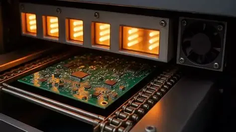
- Environmental Durability: If the PCB will be exposed to harsh conditions—such as high humidity, chemicals, or extreme temperatures—choose silkscreen inks with enhanced resistance. Epoxy-based inks cured with UV light often perform best in these scenarios, maintaining contrast over time.
- Layer Stacking: In multilayer PCBs, ensure that silkscreen layers on both the top and bottom sides maintain high contrast, as assembly and inspection may require flipping the board. Coordinate solder mask colors and silkscreen placement across all layers.
- Regulatory Markings: Some industries require specific markings (e.g., RoHS compliance or serial numbers) on the PCB. Ensure these are included in the silkscreen design with sufficient contrast to meet regulatory readability standards.
How to Collaborate with Your PCB Manufacturer for Optimal Results
Achieving high contrast with black silkscreen isn't just about design—it's also about effective communication with your PCB manufacturer. Provide clear design files with distinct silkscreen layers, and specify your preferences for solder mask color and finish. Request a design rule check (DRC) to catch potential issues like overlapping text or insufficient spacing before production begins.
Additionally, ask for samples or proofs of the silkscreen layer on your chosen solder mask color. This step can help identify contrast issues early, saving time and costs during full-scale manufacturing. If you're unsure about ink types or application methods, consult with the manufacturer to understand their capabilities and recommendations for black silkscreen readability.
Conclusion: Mastering Black Silkscreen for High Contrast PCBs
Optimizing black silkscreen on PCBs for high contrast is a blend of thoughtful design, material selection, and collaboration with your manufacturing partner. By pairing black silkscreen with lighter solder mask colors like white or yellow, choosing durable ink types like epoxy or LPI, and following PCB design tips such as proper spacing and font selection, you can ensure maximum readability and functionality.
High contrast silkscreen PCB design isn't just about aesthetics—it's a practical necessity for efficient assembly, accurate troubleshooting, and long-term reliability. Whether you're designing for consumer gadgets or industrial equipment, taking the time to refine your silkscreen strategy will pay off in smoother production and fewer errors. Start by evaluating your solder mask options and testing prototypes to confirm contrast under real-world conditions, and you'll be well on your way to creating PCBs that stand out for all the right reasons.